
I thought why not, and took a look at the manuscript. It was instant love for me. The story was all about animals and nature, and the words transformed into dancing images in my minds eye, line by line. How could I refuse. I jumped on board and after the editor showed interest in seeing a complete proposal from us, I had to get serious and make one complete illustration and a few sketches to show our vision for the book.

Some general ideas how I wanted the story to flow visually were:
1. Have white areas in each spread
2. Include simple colors to move you through the story, morning to night and sunny to stormy
3. Make the water scenes interesting
4. Play with word placement
4. I wanted the viewer to be enveloped in the scenes and the scenes to carry you visually along. For example the first four spreads: the visual weight starts on the left, the second spread weight is in the middle and then the third on the right, and then the otter spread slides you into the rest of the story in a fun curve.

The first illustration I decided to tackle was the foxes. I figured even if the proposal was declined, I would still be left with a nice engraving for other purposes.

I didn't know much about the foxes, so I did lots of research for reference, finding images of the foxes themselves and of the habitat they lived in. In the original text the foxes were licking their lips, so I found a bunch of images of what animals look like licking their lips too.


I had the main idea already thumbnailed out, so it was a matter of refining that idea further. Here is the first proper sketch for it.
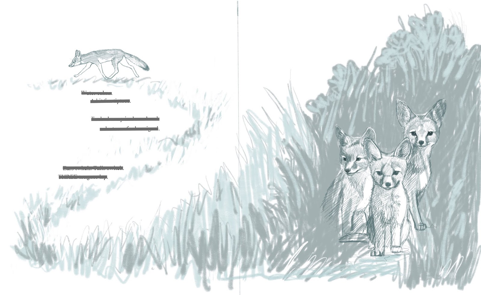
The foxes were drawn in detail (digitally) and then the foliage was sketched quickly for the main shapes. I added the words to make sure it would all look nice together. I didn't have a size for the book yet, but chose a vertical layout, with average dimensions.
I redrew the sketch onto my engraving surface and started carving away. The material for the illustrations for this book is high impact polystyrene (HIPS). It's relatively cheap (compared to wood) and softer to carve. Those two things became very important when the book was acquired, as I had to hand carve several layers for each illustration, in rapid succession.
Here's a snapshot from my desk, carving away the first image. Below is the plate waiting to be proofed.


After I cut and carved away most of the extra areas around the image. I hand burnished the image onto a smooth piece of paper (see below) and then went back to carving the plate again for the second image.

This is the second image, printed from the same plate, after a second session of carving.

Normally, in printmaking and trying to work into a signed edition, you would take the first image, and print it a bunch of times on nice pieces of paper, then go carve the plate some more and and print the same papers on the same spot again, for the second color. This is called a reduction cut, and is very time intensive, and can be a challenge to register and get the images to line up perfectly each time. If you mess up, there is no going back and printing extras, because the plate is destroyed as it gets carved more and more for each successive layer.
To speed the process up, I printed with black on separate pieces of paper, scanned them in, and layered them perfectly on the computer. I could also change colors easily, which would be next to impossible if I printed them traditionally.
Here you see the two layers composed on top of each other. This still seemed a bit plain for me, so for the proposal, I made some edits in Photoshop, to make the image into three colors.

This was the layers digitally broken into 3 colors.

Before submission, I also sketched in some detail the following page of otters to be included in our packet.

Then our agent Essie, put it all together and sent it to the editor.
And then we waited....
Find out what happens next, coming in part 2.
3 comments:
Mirka, You are very patient with illustrating your work. Congratulations on your forthcoming book "Four Otters Toboggan".
Thanks so much Lynette!
Your work is beautiful. Thank you for sharing your process. It has given me a boost of confidence to try some new techniquesin my art and illustrations.
Post a Comment