Thursday, August 25, 2016

Review on Paper and Engraving Blocks

We had a chance to sample some papers sent from Paper-Papers.com and blocks  provided to us by Jim Reynolds. Please see a more in depth review on those supplies in the next post coming up. :)

Here are my three favorite papers that are most suitable for printing engravings/relief:

Savoy - The Top Choice

"Made from 100% pure cotton, SAVOY blends old world elegance with new world sophistication making it the perfect choice for a wide range of projects from greeting cards and invitations to hang tags and luxury packaging. Though originally designed for letterpress, SAVOY also offset and digitally prints beautifully."


These are the color options they sent me.
You can see the texture here. There is some, but pretty smooth. 

Its strong formulation, yet soft flexibility allow for strikingly clean and crisp folding, blind embossing, foil stamping and engraving. These papers were hands down my favorite to print on, largely because out of the stack we received, these are the most archival ones. They feel velvety in hand and the subtle texture picks the ink up nicely without having to dampen the paper. This definitely will be something I'll keep in mind, when buying paper next time. 


Arturo - Second Runner Up

"Created in Italy by Cartiere Magnani exclusively for Legion Paper, Arturo has a luxurious, soft, suble texture created with Magnani's exclusive "Corona" felt. These fine papers are ideal for invitations, announcements or just for people who love written correspondence."

This mouldmade paper, as you can see in the image below, has more texture to it. It still took the image fairly well, but there was more fussing around with pressure. Maybe with wetting, I could have gotten a good impression, without having to put as much pressure, but I prefer to print my relief prints on dry paper.  to prevent buckling when drying. The biggest reason this didn't make top was it is made of 100% high-alpha cellulose instead of rag (cotton). I prefer cotton over wood pulp. But for making lasting prints, Arturo has a neutral pH and is acid and Chlorine free. 


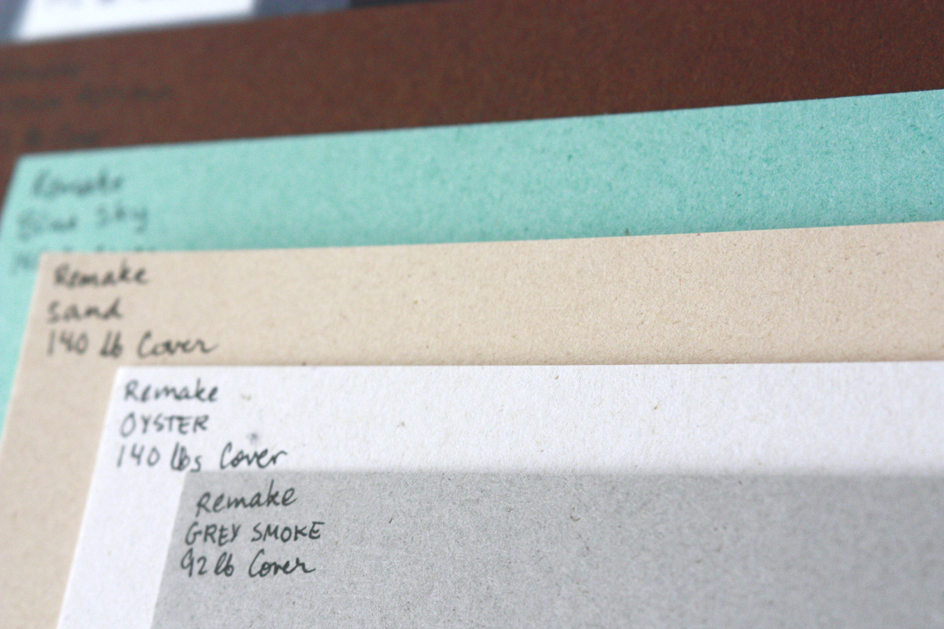
Remake - Fun paper for cards and other seasonal things.

This is a interesting paper line, that includes fibers obtained from leather-making processes. "Eco friendly with the up-cycle heart of using existing fibers from other manufacturing segments, Remake is produced with 25% by-product from the leather goods industry, along with 30% post consumer fibers and 45% FSC certified virgin pulp. Made with 100% green energy."

This paper was fun to look at. It is soft, velvety and has little speckles that give it some depth. The surface is nice and smooth, and it takes ink wonderfully. Really a joy to print on. Because it is made from leather byproducts etc. it is not archival, and I would't use it to print my editions on, but it would be fun for cards, or other more ephemeral things. 

These are some of the colors we got. Love the teal!
A closer up shot to see the speckles. 
Proofing 
I wanted to proof a small block on the papers. I Printed on the various Savoy papers and Arturo, and my setup consisted of a proofing press, and I used 3 sheets of paper over the printing paper for added pressure and give.


In the closeup below picture, the left side is Savoy 118lb paper and on the right is Savoy 92lb paper. The bottom left cat was printed with the same pressure as the 92lb paper, and the image is a little too dark. some of the details have been inked over, so I took out one thin sheets of paper that were buffering, and the resulting pressure gave me the image above it, which is a nice impression (looks a little blown out because of side lighting). 


These were 184lb and gray 236DT cover card stock on the left and on the right a sheet of arturo. You can see on the arturo, the pressure was too light first and you see a lot of the texture of the paper. I adjusted pressure w an extra sheet of paper on the top and it printed great the next time (pic above).


Engraving Blocks Review

Maple block from Reynolds
Jim Reynolds also sent us some sample blocks to try.
I found out about him about a year ago, and have ordered from him a couple times since. He makes both maple end grain blocks and solid surface blocks, which I find both nice to use. 

The solid surface blocks ($0.55 per square inch) are some sort of countertop material as far as I assume. They are white and the solid block is glued to a piece of plywood to make it type high. The material is hard and does not chip like Resingrave does. I really like using it, and can get nice details that hold up while printing. It is easy to see where you are carving, because the material is white. Max size for no seam blocks is 10x14". 

The maple blocks ($0.75 per square inch) have been glued together from smaller pieces. You can purchase block as large as 5x7". I've done several engravings on these blocks too and approve as well. They are obviously rougher to carve than a boxwood block, but for the price and convenience they are hard to beat. Between maple, solid surface and Resingrave, I'd pick solid surface first, then maple and Resingrave last. The top two are both nice in their respective ways. Carving on wood is always nice, because its a warm material and softer. The solid surface blocks work best for me, because I don't have to worry about indentations behind my engravers, because the material is so hard. I don't have to fuss with carving, and can just go at it as I please, which is a big bonus compared to wood. I also like the detail I can get on it, and the ease of seeing my carving as I go. 

All order over $75 ship free in the continental US and all orders under will have 15% shipping charge. All blocks are made to order and take 2-3 weeks to manufacture and deliver. To contact Jim, email him at jmreynolds (at) wi.rr.com or call 414-771-1377. Or if you're in Milwaukee, WI, you could probably pick up your order yourself. 


This block is one of Jim's maple blocks. 
print from the maple block
There is another material that I tried at our recent Wood Engravers Network workshop. That's HIPS, High Impact Poly Styrene. Joanne Price uses it a lot, and the pros for that material are that it is super cheap to get and you can get it in fairly thin plates, so they are light, and easily transportable. I find them a little hard to carve, and pretty soft. There was definitely a learning curve, but I want to give it another go at some point.

Solid surface block with a beginning engraving on it. 
Finished engraving with the finest detail I've done as of yet.
Thanks for reading. If you have any questions on the papers or the blocks please shoot me an email or leave a comment below.

Friday, August 19, 2016

Lakelife multiple block linocut

We had a fun trip to Finland this summer. We spent lots of time at our summer house, and outside in general. I did lots of sketching and photographing and ate plenty of ice cream, candy, pickles and peas (all the things I miss while away). 

A pike we caught in a net, smoked and ate. 
As soon as we got home, I needed to start and finish a portfolio print for Shelley Gipson at Arkansas State University. This was a project I had been looking forwards to the whole summer. The theme was to create an edition together with our child. We talked about it with Aila, and decided since we just got back from Finland, to do something to remind us about the fun times we had. Her favorite thing was to be at the pier and catch fish and other lake life that she could get in her net. We kept them in a bucket during the day and investigated how they lived and interacted. She picked out the animals that she wanted and I drew it in a scandinavian design style, that was attractive for her with bright colors. 

I wanted to include in this post lots of photos of the process. We started out with a very rough sketch, just collecting all the animals on it. Below is the second sketch, where I started working on a design to incorporate all the elements. It's a little light, you can click on the image to see it bigger. At one point I scanned the sketch in the computer, to play around with colors, which area would print with which color. Its faster to do on the computer, since I can quickly change colors to get an idea what the finished print would look like.


Since I was doing 4 colors, I needed to have a key plate, that would be where most of the information for the image would be. That was the first one for me to carve, and after it was done, I rolled it up with black ink, printed it on a transparency, which I then rubbed on the other 3 blank linoleum pieces, to transfer the image. Registration would be pretty important, with 4 plates to match.  

Carving the key block (printed in navy for final image)
After the color separation blocks dried a couple days, I carved them all out. The designs were fairly simple, so this didn't take me too long. I use a Speedball carver for most of the detail work, and then larger Flexcut tools for everything beyond that. They are sharper and easier to cut with than the Speedball, but I've found nothing that will give me better details on linoleum than my Speedball tiny v-cutter. 

Printing

I try to print from the lightest color to the darkest. So with this series, I started with the yellow plate. I mixed a small amount of cobalt drier in the ink, so it would dry faster and allow me to print all colors in a short time. 

Since I had already printed the key block on a transparency, I used that to register my yellow plate down on the press. I use a piece of plywood, with a sheet of mylar glued to it, and I attach the linoleum to the mylar with a light coat of spray adhesive on the back of my linoleum. After those prints were pulled, they hung for a day, and the next day I printed the green color. (Drier mixed in ink again.) 

Below are some shots of the green color in process and drying. I use a 3 tiered clothes drying rack to dry prints, because it folds up when not in use, so its just very convenient. I did not wet the paper for this edition, because I didn't want to deal with uneven stretching, and floppy papers while printing. This was printed on 110lb Lettra. 

second color (green) being printed 

Below you can see the keyplate on the press with the print 3/4 way done. The color elements are all there, red, yellow and green, and it is just waiting for the navy layer to complete the gaps. 


Mixing the navy ink.
I did a short video of the process as well. Its always easier to understand how things proceed, with a video. You can see little foam pads on the side of the block during printing. These help that the paper doesn't lay on the plate until the roller rolls over it. This trick helps keep the print clean from smudges and ink shifting while the paper stretches as its being run through the press. 


Ta-daaa! the finished prints. It took a while to get the prints to print dark enough, but not too dark, where the details would be lost. I was so happy with the print, but the edition was only limited to the amount that we were sending to the portfolio. I have a couple proofs left, and did get nice big postcards done, so if you want one, you can have one on your wall too.


Below are the separate plates used to print on the right, and the ink swatches on the bottom left and first sketch on the bottom.

Once the prints were dry, both of us signed them. 

Aila proud of signing the prints. 

Exited to share the finished image together. 

One of the proofs hanging in the dining room. (Hanger from Ikea)
I was so happy to be invited to participate in this portfolio. It will be up at MAPC conference Oct 5-9, so I will try to get some pictures of all of them together and update this posting. If you would like one of the postcards of the image, they will be listed in my Etsy store in October (with several other new prints!).

For the latest updates, you can always sign up for my email list here (you get a 20% discount code for your first order when you sign up). More to come soon, as I have been printing in the studio like crazy for the last month and a half. I'm super excited to be at two big art fairs this fall, and one or two local holiday showcases, and the conference coming in a week and a half. Squee!!! 

All the best!
Mirka

Wednesday, August 17, 2016

Wood Engravers Network Workshop Part 2/2

To read the previous entry on what happened at our workshop go here.

We had a blast in Houston, and followed up the next day with something even better. A trip to the Cushing Library at Texas A&M Campus. They were simultaneously having a book arts workshop of their own, so we met with them during their break from lectures and then got a tour and visited the print room. Lastly we made our way to the reading room, to explore the wonderful collections of rare books that were set on display for us. Abigail Rorer's books are always my favorite, and I never get tired of flipping through them and looking at the detailed engravings of animals and landscapes. Big thanks goes to Kevin O'Sullivan and Todd Samuelson who hosted us on our tour.

The collection in the library lobby. 
The print room.
A small parlor press was the source of much admiration. 
Kevin O'Sullivan explaining about setting type on wooden composing sticks.
Some hand bound books on display in the lecture room. 


Mould for type casting
Eric Gulliver and Carl Montford discussing the inking ball.
Reading room goodies. 


Block that the above engraving was printed from.
Old 19th century printing blocks. 
Carl Montford enjoying a book.
Clarence Wolfshohl deep in thought. 
Inari Krohn and me looking at a book by Gaylord Shanilec
Jim Horton
Yezid Vergara taking a closer look

Middle back, Carl Montford talking to Todd Samuelson.

The proper way to hold your tool.
After two days of visiting collections, everyone felt quite inspired, so we spent the next two days mostly in the studio working  away. We had a chance to sample some papers sent from Paper-Papers.com and blocks  provided to us by Jim Reynolds. Please see a more in depth review on those supplies in the next post coming up. :)

On Saturday morning some of the folks took a quick detour to the entomology department at A&M. We saw lots of bugs in boxes and got to ask questions about them.

Exploring the bug collections.


Heres a few more photos of the workshop. 

Group photo left to right, Back row: Jim Horton, Eric Gulliver, Jon Hinkel, Carl Montford, Yezid Vergara, Allen Pixley, Clarence Wolfshohl, Tony Drehfal. Front row: Sylvia Pixley, Letitia Alston, Mirka Hokkanen, Inari Krohn, Joanne Price, Michael Ferguson, Margaret Helms. 

We also visited Inari's solo show that was up at the Sead Gallery around the corner from the workshop one day. This is Inari explaining some of her works to Jim. 


Eric Gulliver and Inari's prints

Jon and Carl
Inari and I
Lunch at the Village Cafe.
Clarence's work station
Open portfolio night. We were spent to the public, and pulled all of our works out to show. 
Enjoying a night at the local brewery. Michael Ferguson, Carl Montford, Clarence Wolfshohl and Margaret Helms.
Joanne Price and Yezid Vergara.

Lastly, we had a group project for the workshop. An exquisite corpse print, that everyone could make a mini print for and that would be bound into a tiny book. Here are some of the entries, and I'll post about it when I get mine in hand. (Pages haven't been bound together yet.) 


I was so happy to be able to host the workshop. I really hope the kids are old enough next year to attend the one in New Jersey. If you want to learn more about the Wood Engravers Network, visit our website: http://woodengravers.org, we also have a Facebook page and Instagram account.