Showing posts with label printmaking. Show all posts

Saturday, May 6, 2017

Steamroller printing a Giant Linocut


Hi everyone! Things keep rolling at such a fast pace I haven't had time to write as much as I would have liked to. We will be on summer break soon, and I'll try to be good and post many of the things I've been neglecting. I still have several of the videos from the MAPC printmaking conference I wanted to share with you.

This story begins in February, with the arrival of a huge roll of linoleum.  I had organized the Bryan Art Fair Print fair and steamroller printing the previous year, and since it was a big hit, we wanted to continue and make it a tradition. The fair was on April 8th, this year, so having the linoleum in February made it easy to distribute to the teams that were farther away in the Dallas area.

Mine sat in the studio until end of March, before I had time to do anything with it. I always wanted to do giant animals, so I could really get into the details in fur/feather patterns, and it was a toss up between a pony, a bear and this hawk. After taking a quick poll from some friends, I decided on the hawk. By that time, I had just over a week time to carve it! Yikes.

It ended up being a week and a half of very intensive carving. My whole upper body was so tired by the time the print fair rolled around. Note to self: next time give your older self some more time to complete massive project. I began as I usually do, drawing with pencil onto the linoleum. Since this was huge, I used a projector to trace the feather pattern onto the block. Then I went through a second time looking at my reference photo and actually drew everything in properly. It was a challenge to keep on track with the feathers, especially on the wing. After the whole thing was drawn, I gave it a healthy spraying of clear fixative, so that when I carved, my hand wouldn't smudge all the hard work out of existence.


I attached the block on a piece of masonite with some tape, and was able to work on it propped upright. I had an office chair that could roll back and forth and go up and down, depending which angle and where I needed to carve. It was very helpful to be able to roll back and see the whole image on a glance, rather than having it on a table and seeing it from an angle constantly. It wasn't until the very end, for the background, that I set the block on the table and finished carving it there.


The day of printing was a bit windy, but otherwise gorgeous. Here is Rebecca Villarreal from Pigmint Paper Company rolling up her block.


Steamroller ready to rock n roll. It was super fun to drive!!!


Getting ready to reveal the print.


Prints were hung to dry on the large windows right by us. 


Holding up my first print. Success!


After the event, I spent some time refining the design a bit more. I wasn't crazy about the background, and decided it needed to be a bit different. I made some quick mock ups on the computer to test different backgrounds out and did another quick poll with friends to see which one they responded the best. Everyone liked #3, which was my favorite too. A friend suggested I leave the border out, which was a great idea, so the winning design was a variation of #3.


I went ahead carving the improved background, did some refining in the feathers all over, and ordered large enough sheets of paper to print a small edition. The first batch of paper (Mohawk superfine and thai kozo) was shipped flat, and got all kinked in the mail, which was a pain, because I did not realize it until I had reserved a morning to use a friend's studio and was standing there ready to print. I had to cancel everything, return the paper and order thicker paper (which they did ship rolled), so it would arrive in better condition. 

The new paper arrived a week later: Legion Lenox, 100% cotton drawing paper, 26x40". I had never used it before, and was a little apprehensive, because of the large image and fluffy texture, but it printed beautifully. It embossed heavily, which might be my only negative for it, but I needed the pressure to get it to print nicely without soaking the paper. Here are some pictures from my friend's studio, from 2nd attempt at printing. 


She has a beautiful large etching press as you can see. It's even green- my favorite color! I taped registration marks directly on the bed and also needed to tape the top of each sheet down to print to make sure it got fed in right (I was on my own, with no extra hands). The tape I was using was an artist tape, meant to tape down watercolor paper, but it worked great for this application too. Peeled off easily and is supposed to be acid free (which I am not sure any tape ever is?). You can see the whole printing process in the video below the second studio shot. 


Some images of the finished print. I am really happy the way it turned out. The background looks great and adds to the image.


Headshot


At this point, the prints are drying for at least a day more. I posted a pre-sale in my Etsy store, for the first people who want to get one at a cheaper price before May 25th, 2017 before I take these to Galleries and the price goes up. I printed a total of 20, but used up several sheets of paper for proofing and carving some adjustments to the image. Then there were several that had small areas that I missed with the roller etc. so the final edition will end up being between 10-12.


I am super happy with the way it turned out. It was a long process, and I wouldn't do it again anytime soon, but I'm sure in about a year, time will make the memories golden (as we say in Finnish). Have a great week, talk to you soon!

Thursday, August 25, 2016

Review on Paper and Engraving Blocks

We had a chance to sample some papers sent from Paper-Papers.com and blocks  provided to us by Jim Reynolds. Please see a more in depth review on those supplies in the next post coming up. :)

Here are my three favorite papers that are most suitable for printing engravings/relief:

Savoy - The Top Choice

"Made from 100% pure cotton, SAVOY blends old world elegance with new world sophistication making it the perfect choice for a wide range of projects from greeting cards and invitations to hang tags and luxury packaging. Though originally designed for letterpress, SAVOY also offset and digitally prints beautifully."


These are the color options they sent me.
You can see the texture here. There is some, but pretty smooth. 

Its strong formulation, yet soft flexibility allow for strikingly clean and crisp folding, blind embossing, foil stamping and engraving. These papers were hands down my favorite to print on, largely because out of the stack we received, these are the most archival ones. They feel velvety in hand and the subtle texture picks the ink up nicely without having to dampen the paper. This definitely will be something I'll keep in mind, when buying paper next time. 


Arturo - Second Runner Up

"Created in Italy by Cartiere Magnani exclusively for Legion Paper, Arturo has a luxurious, soft, suble texture created with Magnani's exclusive "Corona" felt. These fine papers are ideal for invitations, announcements or just for people who love written correspondence."

This mouldmade paper, as you can see in the image below, has more texture to it. It still took the image fairly well, but there was more fussing around with pressure. Maybe with wetting, I could have gotten a good impression, without having to put as much pressure, but I prefer to print my relief prints on dry paper.  to prevent buckling when drying. The biggest reason this didn't make top was it is made of 100% high-alpha cellulose instead of rag (cotton). I prefer cotton over wood pulp. But for making lasting prints, Arturo has a neutral pH and is acid and Chlorine free. 


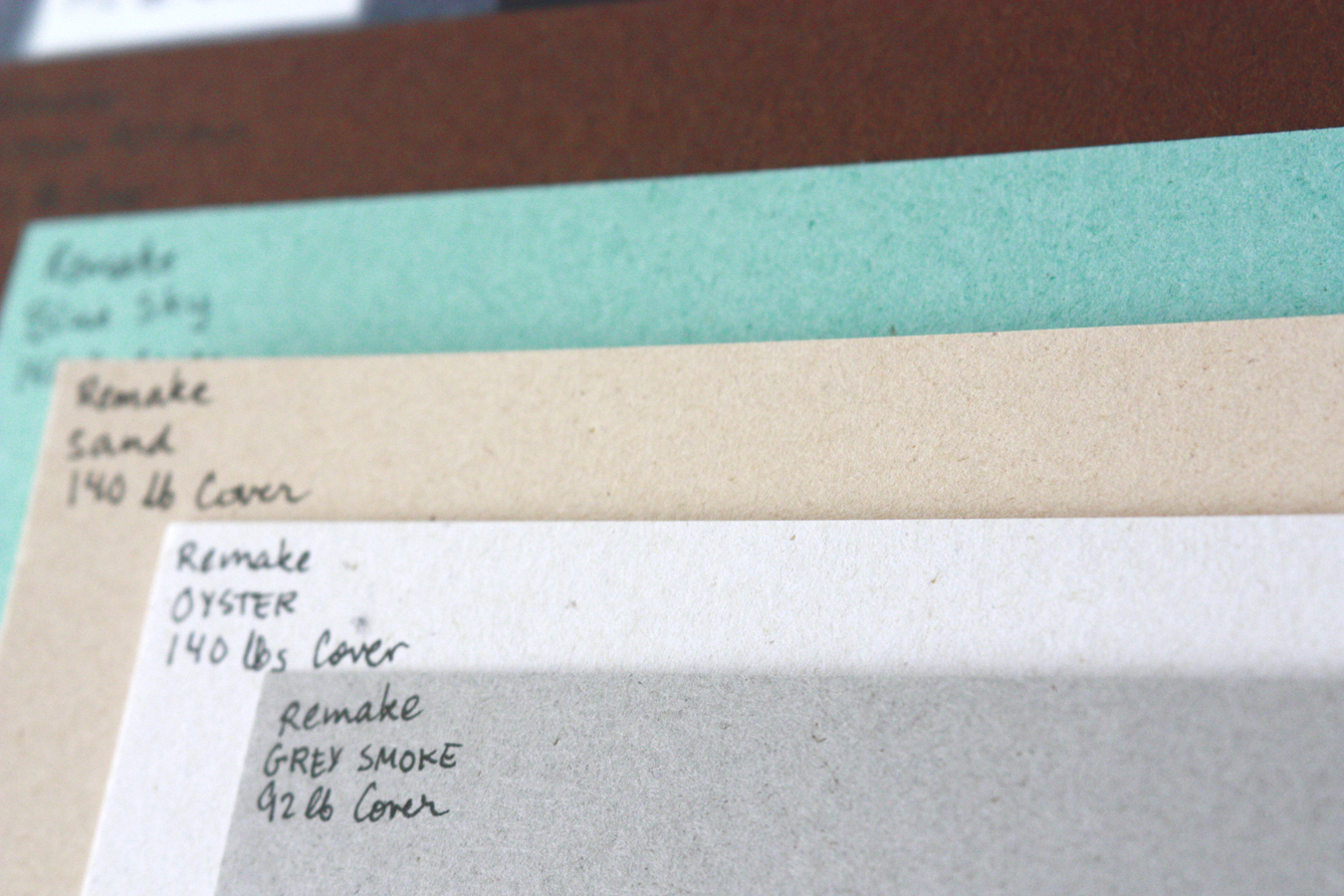
Remake - Fun paper for cards and other seasonal things.

This is a interesting paper line, that includes fibers obtained from leather-making processes. "Eco friendly with the up-cycle heart of using existing fibers from other manufacturing segments, Remake is produced with 25% by-product from the leather goods industry, along with 30% post consumer fibers and 45% FSC certified virgin pulp. Made with 100% green energy."

This paper was fun to look at. It is soft, velvety and has little speckles that give it some depth. The surface is nice and smooth, and it takes ink wonderfully. Really a joy to print on. Because it is made from leather byproducts etc. it is not archival, and I would't use it to print my editions on, but it would be fun for cards, or other more ephemeral things. 

These are some of the colors we got. Love the teal!
A closer up shot to see the speckles. 
Proofing 
I wanted to proof a small block on the papers. I Printed on the various Savoy papers and Arturo, and my setup consisted of a proofing press, and I used 3 sheets of paper over the printing paper for added pressure and give.


In the closeup below picture, the left side is Savoy 118lb paper and on the right is Savoy 92lb paper. The bottom left cat was printed with the same pressure as the 92lb paper, and the image is a little too dark. some of the details have been inked over, so I took out one thin sheets of paper that were buffering, and the resulting pressure gave me the image above it, which is a nice impression (looks a little blown out because of side lighting). 


These were 184lb and gray 236DT cover card stock on the left and on the right a sheet of arturo. You can see on the arturo, the pressure was too light first and you see a lot of the texture of the paper. I adjusted pressure w an extra sheet of paper on the top and it printed great the next time (pic above).


Engraving Blocks Review

Maple block from Reynolds
Jim Reynolds also sent us some sample blocks to try.
I found out about him about a year ago, and have ordered from him a couple times since. He makes both maple end grain blocks and solid surface blocks, which I find both nice to use. 

The solid surface blocks ($0.55 per square inch) are some sort of countertop material as far as I assume. They are white and the solid block is glued to a piece of plywood to make it type high. The material is hard and does not chip like Resingrave does. I really like using it, and can get nice details that hold up while printing. It is easy to see where you are carving, because the material is white. Max size for no seam blocks is 10x14". 

The maple blocks ($0.75 per square inch) have been glued together from smaller pieces. You can purchase block as large as 5x7". I've done several engravings on these blocks too and approve as well. They are obviously rougher to carve than a boxwood block, but for the price and convenience they are hard to beat. Between maple, solid surface and Resingrave, I'd pick solid surface first, then maple and Resingrave last. The top two are both nice in their respective ways. Carving on wood is always nice, because its a warm material and softer. The solid surface blocks work best for me, because I don't have to worry about indentations behind my engravers, because the material is so hard. I don't have to fuss with carving, and can just go at it as I please, which is a big bonus compared to wood. I also like the detail I can get on it, and the ease of seeing my carving as I go. 

All order over $75 ship free in the continental US and all orders under will have 15% shipping charge. All blocks are made to order and take 2-3 weeks to manufacture and deliver. To contact Jim, email him at jmreynolds (at) wi.rr.com or call 414-771-1377. Or if you're in Milwaukee, WI, you could probably pick up your order yourself. 


This block is one of Jim's maple blocks. 
print from the maple block
There is another material that I tried at our recent Wood Engravers Network workshop. That's HIPS, High Impact Poly Styrene. Joanne Price uses it a lot, and the pros for that material are that it is super cheap to get and you can get it in fairly thin plates, so they are light, and easily transportable. I find them a little hard to carve, and pretty soft. There was definitely a learning curve, but I want to give it another go at some point.

Solid surface block with a beginning engraving on it. 
Finished engraving with the finest detail I've done as of yet.
Thanks for reading. If you have any questions on the papers or the blocks please shoot me an email or leave a comment below.

Wednesday, April 8, 2015

Updates of All Sorts

Print I did for the reduction linocut demo
Spring has sprung in Texas and as the seasons change so does my work in the studio. I have dedicated April to be my printmaking-only month. The beginning of the year has flown by sewing customs and I finally had to say "stop" to all that and reclaim my space back as a printing studio. Now that I have cleaned a mountain of fabric and bits of thread off the tables, I have ink, paper and brayers ready to go.

The rest of the year is dotted with lots of print related events so I am happy to be in the studio to make more work and to share it with others. I am also teaching a good amount, and if you are local to the Bryan/College Station area, see my Facebook page for regular events and updates, or if you are not on FB, ask to be put on my local mailing list for events that goes out about once a month. Here's a quick rundown on whats coming up:

First of all I am teaching an ongoing printmaking class on Thursday nights in Bryan, TX. It's been a lot of fun and is open for everyone to attend. There will be several workshops coming up in May and September at the Forsythe Galleries at Texas A&M and the Arts Council of Brazos Valley.

I just did a demo yesterday for the local art league, about reduction linocuts, and will do another one on engraving for the Forsythe Galleries (TAMU) in July.

Demoing at the art league, photo by Nikki Smith
This week I am working on a wood engraving for the cover of the next Wood Engravers Network publication, Block and Burin. It's a really fun project so far. I don't want to reveal the image too much until after it hits the mailboxes, but here's a *little* sneak peak.


As soon as I'm done printing this one, I have a piece to make for an invitational exhibition at the Forsythe Galleries. Some local artists were selected to make work inspired by pieces in the University's collection. I was given a nice watercolor by Stanley M. Long that features a horse and rider to work off of. More on that later when I get to it.  


In May I teach a workshop on making linocut postcards and then take off with the kids to Finland for a month and a half. I'm going to try really hard to finish the book on Finnish wallhangings while I'm there and have my parents help on babysitting the kids. The project has been going for a long time, and I think I have enough to finally put it all together.

After we get back there will be an art fair in Bryan, TX, that I am looking forwards to participating, some classes, and a solo show at the Sead Gallery (also in Bryan) at the end of the year that I'm really excited to create new work for.

I have so many ideas brewing and already know I won't have time to make even half of what I want. Some ideas are for nice exhibition prints and then some ideas are for small prints that would do well at an art fair and on Etsy. Hmmm, and come to think of it my website needs a revamp too, but looking at all this, it'll probably have to wait until the end of the year!

I have some nice websites to share for resources but wanted to do a separate write-up for that. You can look forwards to a press-maker, image resources and other random things that are out there as soon as I get another chance to sit down and write.

Have a great day!
Mirka

Tuesday, February 10, 2015

Imprinting the American West: Engravings from the late 1800's

The Forsyth Galleries at Texas A&M are featuring some prints and paintings depicting the wild west from the 1800's. We visited last week and loved examining the beautiful wood engravings they had on display. I took some cell phone shots so that you can see a little on them too. The variety of mark making from one artist to another is fascinating to me and there is always something to be learned from how they treat surfaces. **As a disclaimer, these shots are not the best, but I did leave the images fairly large, so that you can blow them up to see the best detail.**

First off Fredric Remington, Mexican Infantry on the March, appeared in Harper's Weekly, April 19, 1890. A wood engraving. Based on a painting, this illustration is one of several depicting life in Mexico that the artist made following a 6-week trip on assignment for Harper's Weekly. 

The first image you can see the whole engraving, and then there's three closeups. I really admire the way the Remington has treated the lights and the darks here.  


Below is a closeup of the soldiers. I like the variety of parallel lines, cross hatching and stippling to get all the different values and textures.


The head of the horse has some sets of parallel lines that make up the shapes around the mouth and nose. This almost feels like 3-d modeling to me.


This is another engraving after a painting by Remington. This one is called An Ox Train in the Mountains, it was done for Harper's Weekly for the May 26, 1888 issue. The caption for this one was interesting to me: "As author Randolph Marcy wrote in his influential manual The Prairie Traveler (1859), "when the march is to extend 1500 or 2000 miles, or over rough sandy or muddy road, I believe young oxen will endure better then mules; they will, if properly managed, keep in better condition, and perform the journey in an equally brief space of time. Besides, they are much more economical, a team of six mules costing six hundred dollars, while an eight-ox team only costs upon the frontier about two hundred dollars. Oxen are much less liable to be stampeded and driven off by indians, and can be pursued over and overtaken by horsemen; and, finally, they say, if  necessary, be used for beef.""

As I mentioned with the horse in the above engraving. I really liked the groups of lines that make up the varied shapes both in the landscape and the ox.


The following hand watercolored engraving is based on Henry Farny's original watercolor painting, The Captive. The engraving is titled The Prisoner and was carved for Harper's Weekly, February 13, 1886 issue. The caption for the painting reads: "Quietly dramatic, the scene invites the viewer's speculation as to the prisoner's unenviable fate. The shift in title from The Captive for the watercolor to The Prisoner for the illustration may have been intended to highlight exotic cultural difference: the Plains Indian method of detaining and punishing wrongdoers by exposure to nature's elements differed markedly to the federal and state prison system."

I love the bright red in the indian cloak. It obscures the engraving in places, but when you look at the colored print as a whole, its has just the right amount of black ink and color. It's something hard to achieve, because often the engraving is so powerful the colors look forced.


From this one I would love to learn how to carve grass and so well and am really interested in how the cross hatching in the body on the ground creates the dimensionality of it. 


This picture shows a nice fade from the grass to the hills. Even the distant riders have stippling in them so that they are not too prominent in the image.


Rufus F. Zogbaum, Painting the Town Red, Harper's Weekly, October 16, 1886
This wood engraving shows four cowboys on horseback barreling through a frontier town. It reminds me of the engravings from the original Alics in Wonderland book. The way that the lines are carved, seems like the image was first drawn as a line drawing, which was then carved around to make the plate. If you look closely at the lines in the engraving, they look more like a pen and ink drawing than an engraving like the above showed images.


This was my favorite engraving from the whole exhibition. So there will be a lot of closeups of it. It's called Snake Dance of the Maqui Indians, made for Harper's Weekly, November 2, 1889 issue. Here is what the label stated: "Following a photograph by Cosmos Mindeleff, Farny, a student of Albert Beirstadt drew this performance to serve as an illustration for an article in Harper's Weekly. Indian cultures in the southwest became subjects of increased fascination among anthropologists, artists, and laypersons alike throughout the late nineteenth century due to the growth of the railroad, which reached present-day Albuquerque, New-Mexico, in 1880. The Moqui, or Hopi, culture in present-day Arizona inspired special scrutiny because many of their practices appeared to Anglos to be very similar to witchcraft. The Snake Dance, an elaborate ceremony of rain, ranked among the most frequently represented rites, because it seemed particularly exotic.

Compared to most of his artistic peers, Farny possessed exceptional knowledge and understanding of Indian cultures: He under soot and spoke many Indian languages and was adopted by the Zuni and the Sioux."


The way line is treated in this engraving is so masterful and intriguing. It is very different from the other engravings I showed so far. The carving really shows control of the tools and how to use them just right. I love the way he gets light areas where the sun hits the leaves and the way the texture in the stone walls are created.


Here's some closeups of the people, equally masterfully carved. Again, I apologize for the poor quality of the photos, but you can get a pretty good eyeful of the linework.  


Some smaller people on the wall. I love the way the folds of the clothing is implied on the person on the bottom right corner and the way the store walls are carved to show texture and pattern.


The below photo is somewhat blurry, but the detail shots came out better. I thought it was an interesting depiction of the railroad and buffalo. The maker was indicated as unknown, but it appeared in Frank Leslie's Illustrated Newspaper, in June 3, 1871. It is a wood engraving with watercolor. This one is similar to the four horsemen where it looks like it was partly engraved around a ink drawing. There are some fun details and nice areas where the eye can rest and the watercolor compliments the thin lines nicely.  


I hope you enjoyed this little mini tour of engravings. I've got some limited edition books to share with you too and some new work. As something new, I have a Facebook page now where I feature the latest classes and exhibitions so the blog can be more concentrated on tutorials, introductions and reviews.