
Hi there! I am so glad that the weather is finally warming up and we are able to get outside a bit. Apparently this has been the grayest winter in Germany in over 50 years! We've paid for it by taking turns with Aila being sick since January it seems like. I have a little bit of a cough and runny nose left, but I think we are almost done with it all. Whew. I've been trying to play catchup with work all spring, and have gotten several pieces finished and done. My first wallhanging print is watercolored and waiting for some signatures- hopefully tomorrow. I'll write about that process later. Now before I run too far, I wanted to talk about the portfolio. We showed it at the MAPC conference in Cape Girardeau, and it was recently accepted into an exhibition in Finland in Tampere, but since they have not made the official announcement yet, I'll have to hold my tongue. I'm very excited about it though, and am currently matting all the prints, so they can be framed when we go to Finland mid-May.

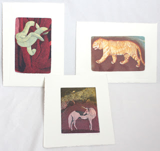
Letters A, B & C - Mirka Hokkanen

Hi, you know me. I chose to do wood engraving for my media. The images were engraved on resingrave blocks and printed on a proofing press. The artists that we chose for the portfolio all work with animal and nature themes, so printing animals for the portfolio was no leap for any of us.
The titles are Ant Eater, Bees in Bluebells and Cats.

Letter D, E & F- Seiko Tachibana
The titles are just the letters d, e, f. The media is drypoint and digital. Seiko is from Japan, and has completed degrees both in her home country and in the US. She currently works in California, and balances Asian traditions with minimalist modernity in her prints.

Seiko writes: "I like to compare the marks, lines, shapes, colors, and textures that are the basic language of my work to living cells, and in the context of an individual block or panel, those cells come together to comprise an organ. When I assemble several individual works together, the blocks and panels then become like organs in a body, a body that is the whole of an artwork. In contemplating the similarities between biological structures and my work, I have discovered many different connections between ourselves and the universe in which we live."

Letters G, H & I - Curtis Bartone
Gabon Viper/Gas Explosion - aluminum plate litho, polymer plate 3 color litho and embossing
Hornet/Housing - aluminum plate litho, polymer plate 3 color litho and embossing
Iktomi/Incinerator - aluminum plate litho, chine colle, embossing
I have interviewed Curtis already, and will be posting that for you shortly. Big fan of his work, and hope you'll love it too! So here's just a sneak preview.

Letters J, K & L - Chandler O'Leary
All prints are linocut, watercolor, cut out with calico fabric in the back. Here is a closeup of the letter J. All the paper inside of the image have been cut out and you can see the light blue flower fabric peeking through.

Chandler works as a designer, illustrator and letterpress artist and I was so glad she agreed to be a part of our portfolio. I think we work from very similar inspirations and I love how she's able to incorporate "high" and "low" art in these beautiful accessible pieces. I always wonder how to do the same without being too crafty. I have wanted to feature an interview of her for a long time and this will be a reason to finally do it. Before I get to it, you can go and visit her website here.

Letters M, N & O - Inari Krohn
Morpho - etching, chine colle
Narwhal - etching, chine colle
Owl - etching, chine colle, wood cut

Inari is an established graphic artist in Finland and around the world. Her works are inspired by Finnish forests and the rhythms of tree branches against the changing skies. She is equally interested in the luminous painterly textures of Japanese woodcuts and the precise, delicate lines of intaglio. The quality and combinations that I see in her prints always capture and surprise me. I love seeing her work in galleries that I visit. Being moer established and having worked for so long, she has built the most amazing home studio which gives me something to aim for when we are done moving around. I look up to her in so many ways.

Letters P, Q & R - Leo Lee
Pangolin v Polyp, Spotted Quoll v Queretaro Desert Snake, Rock Rat v Red Squirrel v Raccoon - all screenprint and watercolor. We asked Leo to make her set using screen printing. I was a little afraid of what you can do with screen printing on such a small scale, but she did not disappoint. These images are so intricate its hard to believe from afar that they are screen printed. They make an amazing example of how you can push the media. I love that she also incorporated some humor into our portfolio with her combinations of animals battling it out.


Letters S, T & U - Sari Bremer
Snake and Tiger are three plate etching and aquatints and Unicorn is two. I learned about Sari's work from Inari. I had mentioned to her that we were looking for an artist who works in animal themes and uses acid etching techniques in her prints. Sari was the perfect fit, and it was nice to have another artist represented from Finland in our portfolio.
Here is what Sari writes about her work: "In my pictures I'm showing places where I've never physically been. The images are allegorical. Yet I wish them to also function on a purely visual level, each whole & complete in itself; tales that need not be interpreted. ... I want the viewer to experience through the images strange places, situations and phenomena. ... The subject matter changes and shifts freely from the stormy sea to the impenetrable jungle."

Letters V, W & X - Lari Gibbons
Vulpes Vulpes, Watersiphora Subtorquata, Xiphophorus Hellerii - all etching, letterpress and mezzotint.
Lari is a friend whom I met when going to graduate school. She both teaches printmaking and directs the P.R.I.N.T. Press at UNT. I don't know how she manages her own time in the studio, but she is amazing and makes it work.

We asked Lari to be in the portfolio, because she is well known for her intricate little mezzotints, and we wanted that technique to be in the portfolio as well. Lari helped us out even more, by adding letterpress to the prints, which no one else was featuring. Here is what Lari said about her pieces in the portfolio: "Because few common animal names begin with "v," "w" and "x" I looked to scientific names for a broader range of options. I also focused on invasive species--especially those that relate to the north Texas region where I live--so that the subjects would explore this overarching theme in my work. Lastly, I made reference photos and drawings at the Elm Fork Natural Heritage Collection at the University of North Texas. The labels that I incorporated in each design provide the common names of each species.
I drew the subjects in a linear style that references technical drawing and illustration. I used mezzotint sparingly, adding subtle drop shadows around each of my subjects. Adding letterpress allowed me to show the relationship of each letter to the entire alphabet and to have a repeating visual element in each print. "
Letters Y & Z and the title page - Jon Lee
Both prints are hand made paper with watermark and woodcut, title page is letterpress.
Jon Lee was the co-curator of our portfolio. We came up with the idea about 2 years ago while I was visiting San Antonio for the visiting artist program at Southwest School of Art and Craft. Jon is so creative and talented in a multitude of ways. He has excellent craftsmanship and I love visiting and seeing all the things he has made. His skill as a master craftsman is integral to the creative artist work, as you can see in the prints. Even though his work looks minimal, so much has gone into it in thought, labor and skill. It is very beautiful to behold.

On another interesting note Jon is active in papermaking and printmaking research, adapting age-old traditions to contemporary uses. He is a native of South Korea and has worked as a professional printer for eight years, both in Korea and in the United States. Upon completing his Master Printer Training at theTamarind Institute of Lithography, he moved to Iowa to earn his MFA in printmaking at the University of Iowa. He currently works as a printmaker, papermaker and educator and is an Assistant Professor at Trinity University, San Antonio, Texas.
 |

I'm so happy to be a part of the portfolio. It was a great experience putting it together. I have Curtis' interview already in my mailbox and will post it shortly for you to enjoy!