Friday, September 17, 2010

Exhibition at Tacoma Art Place


I have an exhibition up at Tacoma Art Place at the moment. Quick exhibit info:
Where: TAP, 1116 S. 11th St. Tacoma, WA
When: until Oct 10th
(If you can't make it to this one, no worries, I have exhibitions coming up in November, January and April.)

TAP is a non-profit art center in the middle of Tacoma. It is a great (and affordable!) place where locals can get together and make art. There are sewing machines, ceramic equipment, a photography dark room, stained glass and beading supplies to name some.

The front office faces the street and has some walls open for exhibition space. If you are interested in having a show there, contact the TAP exhibition coordinator for more info. The show was easy to set up, and I like the way it turned out. I was excited to show some new pieces that have not been out if Tacoma before.

Just two pictures from the reception below. The Tacoma art bus stopped by and brought a whole bunch of people by, and I was asked to talk a little about the artwork. The bus is a pretty fun idea. The galleries in Tacoma are spread apart, so instead of trudging to each one by your self, you can have a party on the bus, which makes stops around the best galleries in Tacoma every third thursday. The tickets are only $10 for the whole night. I need to get on this bus next month!


My work has also been featured on a couple of Etsy treasuries and a blog in the last months. I love both of these treasuries. One has a bird theme, and the other has such pretty colors!


The same bird print was also featured on Diane's Etsy Favorites blog. Her blog is worth checking out, she features her favorite picks from the endless universe of Etsy items.


Oma Koti Onneni


Oma koti onneni-thats Finnish and it means "My house is my happiness". The concept of a print with an aphorism with a border and embellishments comes from a Finnish handcraft tradition that was popular in the early 1900's (see small insert on left). We have several of these huoneentaulu's/wall hangings at our house, and I have been fascinated by them for a long time. I started a project to collect as many images of wall hangings as I can find and see what commonalities I can find in them and what they tell of their times. I want to update the old tradition that is about to disappear, and make contemporary prints that people still would hang on their walls today. You can find more information about the project here. For the main project for the letterpress class at SVC, I decided to try out some ideas gathered from the wall hangings I have been sent so far.

I started by setting a large border of type ornaments and type inside of it as seen above. This process took me hours upon hours to complete just to get all the little spaces filled up so that not even one little piece nudged inside the border. I then proofed the block on a small proofing press. That revealed a bunch more problems, with a couple of the ornaments being shorter than others and one that was very high.

You can see the arrow on the right, the ornament too high creates a halo around it, and some areas on the left and middle where the ornaments did not print at all or very faintly. To correct the shorter ornaments, I had to pull them out carefully and add a little piece of tissue paper under it to lift it up. That worked great.

Here you can see a closeup of the ornaments. Everything is bundled up really tight.
After the block was proofed, I was able to figure out how and where to carve my linoblock. Below is a mockup of the finished print dimensions and with the design drawn on the linoblock.

Here is a picture of the ornament border and type locked up front to back and sideways on the Vandercook press. I was able to get this done the previous weekend to printing, because just transferring everything and locking it up, revealed many more pieces that wiggled, so I had to keep working on it before it was ready to print. Below are some pictures from the middle of printing. You can see the finished print with two colors in the back and the front with only the ornament border and type printed on it.

Here is the linoblock locked up on the press with ink rolled and ready to go. The linoblocks are so much easier to lock up!

For the finished piece, I added a little bit of pink watercolor to highlight the flowers. It is really hard to capture a good image. It is printed on a cream colored Stonehenge paper, with fairly light inks- with the pink watercolor. Light colors dont transfer well on a computer screen. It looks so much better in person. The size of the print is about 9"x12" and the paper is a couple of inches all the way around. The original hand embroidered wall hangings are about 2-4 times bigger so I wish I could have printed larger, but the press that I had to work with limited the size to less than 15x18". This is a nice size though, smaller is always easier to frame and is still big enough to make a statement on the wall. I look forwards to working on this project, and eventually putting it all in a book.


Friday, August 27, 2010

From Start to Finish


For some people it is a mystery what I do, and how a piece of art is created. I finally remembered to keep a camera on me, so here is a little story of how my latest print came to be.

I am currently working on illustrating a book, where the main character is a little Winter Wren. I have been doing some research on the bird and found an interesting tidbit of information that I wanted to share with people. I also wanted to practice drawing wrens before starting with illustrating. So that's where the idea came from.

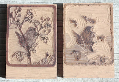
Making the Image and the Blocks. I looked through my own photos and through some online for reference for vegetation and birds. Then I had to figure out size- I wanted to make something small, so 4"x5" it was... I came with a sketch of the basic composition in my head, and then drew it out on a piece of paper as you can see on the left.

To make the print more interesting, I wanted to make it two colors. To figure out where colors should go, I transferred the original drawing on vellum, and then was able to trace the second color on top of it. When you layer them together you can get an idea of what the final print would look like.

I scanned the ink drawings on the computer, and printed them out on a lazer printer. The images were transferred to linoblocks as I described in my last blogpost. Where after I proceeded to carve them with linocarving tools.

Paper, Ink and Text. Next I figured out what size paper would be best to print on and proceeded to tear big sheets to the right size. For smaller prints, in general it looks nice to have at least two inches of white paper on each side of the printed area. I had to also figure out what colors I wanted to print with and mix ink accordingly. For the text, each letter had to be picked out of a drawer and set in the form you want them to print with. (Sorry I forgot to take a picture of that...)


Printing. I was very excited to print at the letterpress shop at SVC Seattle with an old school Chandler & Price press. It's amazing to think that this press was built about 100 years ago! Wish they built things like that today... For this wren print, I had to print on each sheet of paper three times- first the light color linoblock, then the dark color linoblock, and after that the text with the dark color also. The press also had to be cleaned for each color of ink to print.

Finishing the Edition. Lastly, I could bring my fresh prints home, go through them to toss out all the bad/ misregistered ones, clean out dirty marks and then sign and edition the rest of the prints that made it to the edition.

Now after that being read, aren't you excited about trying printmaking too! You might ask, why would you do that to your self, would it not just be easier to paint a picture. Well, yes and no. Sure, I can paint it, but I absolutely love the physical processes of printmaking. I love carving plates, being worn out after a day of printing, even the never ending challenges when things don't want to work out (trust me there are a LOT of glitches). And as icing on the cake, instead of just one painting at the end of the day, I have a set of prints, that I can sell more affordably, so that many more people can enjoy my art (for sale here).

I found a quote, that describes everything quite well:
"I must confess, I love my press.
For when I print, I know no stint
of joy."

I think I need to have that on a t-shirt...
Next post, I'll write about the last half of the letterpress class at SVC (ref. last posting) and the print that I made for it.
Till then, cheers!

Tuesday, July 13, 2010

Letterpress Revelations


As I mentioned a couple of weeks ago, I am taking a letterpress class with Jenny Wilkson at SVC Seattle right now. Class has been so much fun and I have learned at least a couple of new things about letterpress. In the first picture on the top our instructor, Jenny Wilkson, is showing us how to set type and how to transfer it from gallery to press without dropping type on the floor. It's all in the flick of the wrist. During the first class we all set our names in type and printed them all together on the press. We all got to take turns to crank out a sheet.


For our second class we were joined by Carl Montford, who is accomplished in wood engraving. He brought some of the most amazing broadsides to show and explained the process of carving to us. At the end of the class, we all got to work on our own linocuts.
I learned a new way of transferring an image onto your linoblock. Here's how you do it: First make a lazer copy of the image you are transferring. (either from computer lazer printer or lazer copier) Make sure it is very dark, and this will make the whole process easier. Cut the image smaller and tape one edge of it to your block. Below is Carl explaining the process, you can see the lazer printed image with one side taped to the block.


Put the block down and pour a little mineral spirit over it (please have well ventilated area, I would also advise gloves). Wipe off the excess mineral spirit with a rag and distribute it evenly onto the back of the paper.


After that we took a heating tool, and pressed firmly on the back of the paper where the image is. Some smoke will arise but it's (apparently) normal. Don't press too long or the wand will lose too much heat. You'll notice the image gets fainter if the wand gets too cold if you have a large image to work with. You could also try an iron on the highest setting or one of the small hobby irons.


The transferred image. I liked this, because the image will not rub off, when you handle the plate and it is more accurate than using carbon paper or pencil rubbing to transfer your image.

Here we are hard at work carving our linocuts...


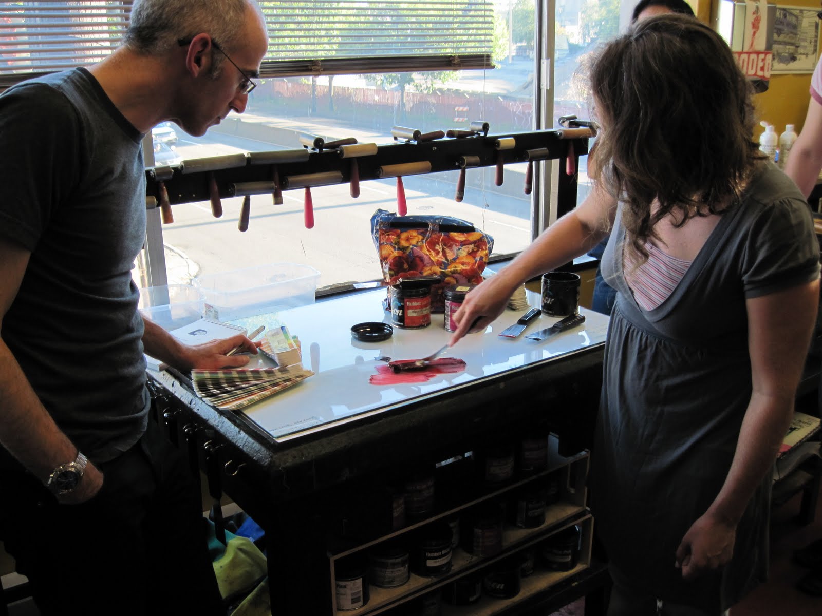
This is my two block print that I started working on. I can't wait to print it at some point in the future. Last class we learned how to mix ink. A tip for some: make sure you use a different ink knife for each can of ink you open, and yet another one for mixing the ink. That way if you have to get more ink out of the cans, you wont contaminate the clean ink with any other colors. For next week, we have to have mockups ready of our prints. I am running behind on this, so I need to go in really early today and try to finish my design before class starts. I'll take some more pictures tonight! I can't wait to see all the cool prints that are going to come out of this class. :)


Honored in Kent

I was part of the City of Kent juried summer art exhibit this year. The show opened last week with a busy reception. I was so happy to see friends from as far as Bellevue and Lacy and make new ones from all around the area. I'll put some pictures from the exhibit. The level of artwork was high, and I was happy to be a part of it all. You can still go and visit until Aug 27th, 2010, at the Centennial Center gallery (400 W. Gowe St, Kent, WA). Gallery hours are 8am-5pm during weekdays.


This exhibition has been so special to me. My work has been honored in so many ways. My image of a bullfinch made it to the front of the exhibition card and I received two awards in the show- a purchase award to be included in the City of Kent portable works collection and the Gallery Award to have a 2 month exhibition next year. And to top it off, most of the work sold by the end of the night. I feel so very blessed (James 1:17). I am so excited to have a show opportunity in Kent. The space is great, with lots of traffic, so it will be possible to reach a wide audience.

I just wanted to mention at least one other artist who is in the juried show with me. Maria Coryell-Martin has her work right next to mine on the wall. You can see her work on the second picture from the top. Her work is exciting through how it is created- bringing together art, outdoors and science- to raise environmental awareness. Maria makes color sketches in the field in freezing environments and then develops them into large watercolor paintings in her studio. Here is a short excerpt from her website: "As an Expeditionary Artist, I travel to remote regions and paint environments vulnerable to climate change, following the tradition of traveling artists such as Emily Carr in British Columbia, Thomas Moran in the American West, and Edward Wilson in Antarctica. Since 2005, I have focused on polar and glaciated environments, including Greenland, Antarctica, British Columbia, and the North Cascades mountains in Washington State." Currently she is getting ready to head to Greenland for an expedition. How exciting is that!


Tuesday, June 22, 2010

Two etching techniques and Pronto plate results


Good day to you! I am feeling great today after my surgery. I have not even needed to take a pain killer yet! Praises to God for that. I know a lot of people have been praying for me, and I think it has really helped.

Today is the first day of my letterpress class, and as I had written before, I wanted to blog about my previous one before I jump into the next one. I also taught an acrylic plate litho class over the weekend, and we had great results with different media.

So at the nontoxic printmaking class we also used two different soft grounds. The first one was made by using Graphic Chemical water based relief ink- Crimson Red #1661 and Lascaux Transparentlack #2060. The transparentlack was added to make the ink dry quicker on the plate- don't use too much of it or it will dry too quickly. We mixed in ratio of 1 part transparentlack and 3 parts red ink. There are some interesting comments on the technique in the Graphic Chemical Bulletin board.


Below- we were using a thin aluminum plate from an offset litho place as a rolling out surface. A fun idea.
below- here is the teacher rolling out the red base on the plate. There is a limited time to work on this, so I would not go out to lunch in the middle of all this. After the ink has been rolled out, let it dry slightly, just a couple of minutes, and then roll it though the press with what ever you were going to use on your soft ground. Tip- to keep backing paper around your feather or other material, sticking down to the softground, slightly oil a piece of mylar and set it over the plate and softground materials before running through the press. That way no extra soft ground gets picked up. For the same problem you can also just cover the areas up with the johnson hardground by hand after you ran it through the press.

I did some pieces of moss and leaves for my soft ground try out. The dark areas on my plates are aquatint that was sprayed to keep some of the more open areas from completely open biting.

You can also use the red ground as a regular etching resist hard ground. After rolling it out, dry it on a hot plate for about 20 min. It will stay flexible enough for a little while (day or so) so you could just draw through it with you etching needle. I like this option, because this ground stays on pretty well, and you don't have to be as careful with it as you have to with the johnson hardgrounds. The result looks much like a traditional line etching with asphaltum hard ground.

The second soft ground we did was mixing 3 parts Graphic Chemical water based ink Black #1659 and 1 part Lascaux Transparentlack #2060. This works similar to the red ink soft ground, but the ink granules are more coarse. You can either roll the ground on and then manipulate it with distilled water or then mix it with dist. water in little cups for several "strengths" to paint with directly on the plate. The different thicknesses of ground will let the ferric chloride bite though at different lengths of time. We used an Edinburg etch for all the etching in the class. Below is an example of a plate that we were working with the black ground - rolling it on and painting it with water ground mixture.

I like the possibility of some really nice tousche type washes with these grounds. You can use the red ground in the same way as the black. After rolling the red ground on you can use distilled water, which will separate the ink particles. The red will give you a finer wash and the black a coarser wash. You can also use sticks, q-tips and different type of brushes to manipulate the ground. If you are using the red ink just on its own without the transparentlack, you can get a stepped aquatint where the lighter applied areas will etch through first and thicker applied areas etching last. Below some pictures of us mixing the grounds and painting on them.


Here is a nice example of the soft ground wash etched on a plate. The plate, the print and a closeup:


I also found another link for floorwax etching ground using Future-floor polish. It can be found here.
Whew, are you still ready for some more information? Here are some images from the plastic plate lithography I taught over the past weekend. I had previously used Z-Acryl plates, and this time I had ordered some Pronto plates. I wanted to see what the differences were. I was also interested in trying this out, since from my research I had figured that crayon drawings might work better on these plates.

We were able to try out several techniques. One of the students brought in her drawing and she just ran over to Office Max to get that xeroxed on to a plate. Her prints turned out great, exactly like her original drawing was. Here are a couple of pictures of that.


Above- proofing on the press.
below- the plate itself and below that the print from it.

Closeups of both.

I was really excited to try what happened when we used crayons on this material. I read that Korn's litho crayon #4 works best, so I had some of those ready on hand. One of the students made a drawing with it. To our horror as soon as we wiped the plate wet, the crayon washed right off. But to our suprise, the crayon had left an oily residue, that picked up ink as we rolled it up. We only had time to proof it twice, and the results were very interestng. I think if we would have rolled it up a little more, it would have rolled up quite nicely. So I was very encouraged by the results! Drawing with crayons on the Z-Acryl plates in the past did not seem to work at all. The ink would pick up when rolling, and leave behind nothing. Another 2 things I liked better with the pronto plates, was the there is no wrong or right side and that it is more translucent. Having it more translucent makes it easier to work with for beginning students I think, if they need to trace their drawings.


Here is a proof of a horse drawn quickly with a ball point pen. This is a pretty foolproof media to use on the plates.


That was quite a long post, but I'm glad I got to report on all the exciting things I've discovered in the last couple of days and months. Hope you enjoyed it, letterpress stuff to follow next.