Showing posts with label news. Show all posts

Saturday, May 6, 2017

Steamroller printing a Giant Linocut


Hi everyone! Things keep rolling at such a fast pace I haven't had time to write as much as I would have liked to. We will be on summer break soon, and I'll try to be good and post many of the things I've been neglecting. I still have several of the videos from the MAPC printmaking conference I wanted to share with you.

This story begins in February, with the arrival of a huge roll of linoleum.  I had organized the Bryan Art Fair Print fair and steamroller printing the previous year, and since it was a big hit, we wanted to continue and make it a tradition. The fair was on April 8th, this year, so having the linoleum in February made it easy to distribute to the teams that were farther away in the Dallas area.

Mine sat in the studio until end of March, before I had time to do anything with it. I always wanted to do giant animals, so I could really get into the details in fur/feather patterns, and it was a toss up between a pony, a bear and this hawk. After taking a quick poll from some friends, I decided on the hawk. By that time, I had just over a week time to carve it! Yikes.

It ended up being a week and a half of very intensive carving. My whole upper body was so tired by the time the print fair rolled around. Note to self: next time give your older self some more time to complete massive project. I began as I usually do, drawing with pencil onto the linoleum. Since this was huge, I used a projector to trace the feather pattern onto the block. Then I went through a second time looking at my reference photo and actually drew everything in properly. It was a challenge to keep on track with the feathers, especially on the wing. After the whole thing was drawn, I gave it a healthy spraying of clear fixative, so that when I carved, my hand wouldn't smudge all the hard work out of existence.


I attached the block on a piece of masonite with some tape, and was able to work on it propped upright. I had an office chair that could roll back and forth and go up and down, depending which angle and where I needed to carve. It was very helpful to be able to roll back and see the whole image on a glance, rather than having it on a table and seeing it from an angle constantly. It wasn't until the very end, for the background, that I set the block on the table and finished carving it there.


The day of printing was a bit windy, but otherwise gorgeous. Here is Rebecca Villarreal from Pigmint Paper Company rolling up her block.


Steamroller ready to rock n roll. It was super fun to drive!!!


Getting ready to reveal the print.


Prints were hung to dry on the large windows right by us. 


Holding up my first print. Success!


After the event, I spent some time refining the design a bit more. I wasn't crazy about the background, and decided it needed to be a bit different. I made some quick mock ups on the computer to test different backgrounds out and did another quick poll with friends to see which one they responded the best. Everyone liked #3, which was my favorite too. A friend suggested I leave the border out, which was a great idea, so the winning design was a variation of #3.


I went ahead carving the improved background, did some refining in the feathers all over, and ordered large enough sheets of paper to print a small edition. The first batch of paper (Mohawk superfine and thai kozo) was shipped flat, and got all kinked in the mail, which was a pain, because I did not realize it until I had reserved a morning to use a friend's studio and was standing there ready to print. I had to cancel everything, return the paper and order thicker paper (which they did ship rolled), so it would arrive in better condition. 

The new paper arrived a week later: Legion Lenox, 100% cotton drawing paper, 26x40". I had never used it before, and was a little apprehensive, because of the large image and fluffy texture, but it printed beautifully. It embossed heavily, which might be my only negative for it, but I needed the pressure to get it to print nicely without soaking the paper. Here are some pictures from my friend's studio, from 2nd attempt at printing. 


She has a beautiful large etching press as you can see. It's even green- my favorite color! I taped registration marks directly on the bed and also needed to tape the top of each sheet down to print to make sure it got fed in right (I was on my own, with no extra hands). The tape I was using was an artist tape, meant to tape down watercolor paper, but it worked great for this application too. Peeled off easily and is supposed to be acid free (which I am not sure any tape ever is?). You can see the whole printing process in the video below the second studio shot. 


Some images of the finished print. I am really happy the way it turned out. The background looks great and adds to the image.


Headshot


At this point, the prints are drying for at least a day more. I posted a pre-sale in my Etsy store, for the first people who want to get one at a cheaper price before May 25th, 2017 before I take these to Galleries and the price goes up. I printed a total of 20, but used up several sheets of paper for proofing and carving some adjustments to the image. Then there were several that had small areas that I missed with the roller etc. so the final edition will end up being between 10-12.


I am super happy with the way it turned out. It was a long process, and I wouldn't do it again anytime soon, but I'm sure in about a year, time will make the memories golden (as we say in Finnish). Have a great week, talk to you soon!

Wednesday, April 8, 2015

Updates of All Sorts

Print I did for the reduction linocut demo
Spring has sprung in Texas and as the seasons change so does my work in the studio. I have dedicated April to be my printmaking-only month. The beginning of the year has flown by sewing customs and I finally had to say "stop" to all that and reclaim my space back as a printing studio. Now that I have cleaned a mountain of fabric and bits of thread off the tables, I have ink, paper and brayers ready to go.

The rest of the year is dotted with lots of print related events so I am happy to be in the studio to make more work and to share it with others. I am also teaching a good amount, and if you are local to the Bryan/College Station area, see my Facebook page for regular events and updates, or if you are not on FB, ask to be put on my local mailing list for events that goes out about once a month. Here's a quick rundown on whats coming up:

First of all I am teaching an ongoing printmaking class on Thursday nights in Bryan, TX. It's been a lot of fun and is open for everyone to attend. There will be several workshops coming up in May and September at the Forsythe Galleries at Texas A&M and the Arts Council of Brazos Valley.

I just did a demo yesterday for the local art league, about reduction linocuts, and will do another one on engraving for the Forsythe Galleries (TAMU) in July.

Demoing at the art league, photo by Nikki Smith
This week I am working on a wood engraving for the cover of the next Wood Engravers Network publication, Block and Burin. It's a really fun project so far. I don't want to reveal the image too much until after it hits the mailboxes, but here's a *little* sneak peak.


As soon as I'm done printing this one, I have a piece to make for an invitational exhibition at the Forsythe Galleries. Some local artists were selected to make work inspired by pieces in the University's collection. I was given a nice watercolor by Stanley M. Long that features a horse and rider to work off of. More on that later when I get to it.  


In May I teach a workshop on making linocut postcards and then take off with the kids to Finland for a month and a half. I'm going to try really hard to finish the book on Finnish wallhangings while I'm there and have my parents help on babysitting the kids. The project has been going for a long time, and I think I have enough to finally put it all together.

After we get back there will be an art fair in Bryan, TX, that I am looking forwards to participating, some classes, and a solo show at the Sead Gallery (also in Bryan) at the end of the year that I'm really excited to create new work for.

I have so many ideas brewing and already know I won't have time to make even half of what I want. Some ideas are for nice exhibition prints and then some ideas are for small prints that would do well at an art fair and on Etsy. Hmmm, and come to think of it my website needs a revamp too, but looking at all this, it'll probably have to wait until the end of the year!

I have some nice websites to share for resources but wanted to do a separate write-up for that. You can look forwards to a press-maker, image resources and other random things that are out there as soon as I get another chance to sit down and write.

Have a great day!
Mirka

Monday, May 6, 2013

Smells like Summer... Finally!

Hi there! I am so glad that the weather is finally warming up and we are able to get outside a bit. Apparently this has been the grayest winter in Germany in over 50 years! We've paid for it by taking turns with Aila being sick since January it seems like. I have a little bit of a cough and runny nose left, but I think we are almost done with it all. Whew. I've been trying to play catchup with work all spring, and have gotten several pieces finished and done. My first wallhanging print is watercolored and waiting for some signatures- hopefully tomorrow. I'll write about that process later. Now before I run too far, I wanted to talk about the portfolio. We showed it at the MAPC conference in Cape Girardeau, and it was recently accepted into an exhibition in Finland in Tampere, but since they have not made the official announcement yet, I'll have to hold my tongue. I'm very excited about it though, and am currently matting all the prints, so they can be framed when we go to Finland mid-May.


I mainly wanted to post a lot of images of the prints in the portfolio and talk a little about each artist. I'll interview a couple, for some more in-depth stories. The theme of the portfolio was animal ABC's. We wanted to do a small portable set with artist working in different media, so that it would also function as a teaching tool. Each artist also contributed three prints, so that you can better see the style that they work in. I love multi functionality- our portfolio is like a little Swiss Army knife! Lets introduce our artists:

Letters A, B & C - Mirka Hokkanen


Hi, you know me. I chose to do wood engraving for my media. The images were engraved on resingrave blocks and printed on a proofing press. The artists that we chose for the portfolio all work with animal and nature themes, so printing animals for the portfolio was no leap for any of us.


The titles are Ant Eater, Bees in Bluebells and Cats.


Letter D, E & F- Seiko Tachibana
The titles are just the letters d, e, f. The media is drypoint and digital. Seiko is from Japan, and has completed degrees both in her home country and in the US. She currently works in California, and balances Asian traditions with minimalist modernity in her prints. 


Seiko writes: "I like to compare the marks, lines, shapes, colors, and textures that are the basic language of my work to living cells, and in the context of an individual block or panel, those cells come together to comprise an organ. When I assemble several individual works together, the blocks and panels then become like organs in a body, a body that is the whole of an artwork. In contemplating the similarities between biological structures and my work, I have discovered many different connections between ourselves and the universe in which we live."


Letters G, H & I - Curtis Bartone
Gabon Viper/Gas Explosion - aluminum plate litho, polymer plate 3 color litho and embossing
Hornet/Housing - aluminum plate litho, polymer plate 3 color litho and embossing
Iktomi/Incinerator - aluminum plate litho, chine colle, embossing 

I have interviewed Curtis already, and will be posting that for you shortly. Big fan of his work, and hope you'll love it too! So here's just a sneak preview.


Letters J, K & L - Chandler O'Leary
All prints are linocut, watercolor, cut out with calico fabric in the back. Here is a closeup of the letter J. All the paper inside of the image have been cut out and you can see the light blue flower fabric peeking through. 


Chandler works as a designer, illustrator and letterpress artist and I was so glad she agreed to be a part of our portfolio. I think we work from very similar inspirations and I love how she's able to incorporate "high" and "low" art in these beautiful accessible pieces. I always wonder how to do the same without  being too crafty. I have wanted to feature an interview of her for a long time and this will be a reason to finally do it. Before I get to it, you can go and visit her website here.  


Letters M, N & O - Inari Krohn
Morpho - etching, chine colle
Narwhal - etching, chine colle
Owl - etching, chine colle, wood cut


Inari is an established graphic artist in Finland and around the world. Her works are inspired by Finnish forests and the rhythms of tree branches against the changing skies. She is equally interested in the luminous painterly textures of Japanese woodcuts and the precise, delicate lines of intaglio. The quality and combinations that I see in her prints always capture and surprise me. I love seeing her work in galleries that I visit. Being moer established and having worked for so long, she has built the most amazing home studio which gives me something to aim for when we are done moving around. I look up to her in so many ways.  


Letters P, Q & R - Leo Lee
Pangolin v Polyp, Spotted Quoll v Queretaro Desert Snake, Rock Rat v Red Squirrel v Raccoon - all screenprint and watercolor. We asked Leo to make her set using screen printing. I was a little afraid of what you can do with screen printing on such a small scale, but she did not disappoint. These images are so intricate its hard to believe from afar that they are screen printed. They make an amazing example of how you can push the media. I love that she also incorporated some humor into our portfolio with her combinations of animals battling it out. 


Letters S, T & U - Sari Bremer
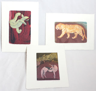
Snake and Tiger are three plate etching and aquatints and Unicorn is two. I learned about Sari's work from Inari. I had mentioned to her that we were looking for an artist who works in animal themes and uses acid etching techniques in her prints. Sari was the perfect fit, and it was nice to have another artist represented from Finland in our portfolio. 


Here is what Sari writes about her work: "In my pictures I'm showing places where I've never physically been. The images are allegorical. Yet I wish them to also function on a purely visual level, each whole & complete in itself; tales that need not be interpreted. ... I want the viewer to experience through the images strange places, situations and phenomena. ... The subject matter changes and shifts freely from the stormy sea to the impenetrable jungle."


Letters V, W & X - Lari Gibbons

Vulpes Vulpes, Watersiphora Subtorquata, Xiphophorus Hellerii - all etching, letterpress and mezzotint. 
Lari is a friend whom I met when going to graduate school. She both teaches printmaking and directs the P.R.I.N.T. Press at UNT. I don't know how she manages her own time in the studio, but she is amazing and makes it work. 


We asked Lari to be in the portfolio, because she is well known for her intricate little mezzotints, and we wanted that technique to be in the portfolio as well. Lari helped us out even more, by adding letterpress to the prints, which no one else was featuring. Here is what Lari said about her pieces in the portfolio: "Because few common animal names begin with "v," "w" and "x" I looked to scientific names for a broader range of options. I also focused on invasive species--especially those that relate to the north Texas region where I live--so that the subjects would explore this overarching theme in my work. Lastly, I made reference photos and drawings at the Elm Fork Natural Heritage Collection at the University of North Texas. The labels that I incorporated in each design provide the common names of each species. 
I drew the subjects in a linear style that references technical drawing and illustration. I used mezzotint sparingly, adding subtle drop shadows around each of my subjects. Adding letterpress allowed me to show the relationship of each letter to the entire alphabet and to have a repeating visual element in each print. " 


Letters Y & Z and the title page - Jon Lee
Both prints are hand made paper with watermark and woodcut, title page is letterpress. 
Jon Lee was the co-curator of our portfolio. We came up with the idea about 2 years ago while I was visiting San Antonio for the visiting artist program at Southwest School of Art and Craft. Jon is so creative and talented in a multitude of ways. He has excellent craftsmanship and I love visiting and seeing all the things he has made. His skill as a master craftsman is integral to the creative artist work, as you can see in the prints. Even though his work looks minimal, so much has gone into it in thought, labor and skill. It is very beautiful to behold. 


On another interesting note Jon is active in papermaking and printmaking research, adapting age-old traditions to contemporary uses. He is a native of South Korea and has worked as a professional printer for eight years, both in Korea and in the United States. Upon completing his Master Printer Training at theTamarind Institute of Lithography, he moved to Iowa to earn his MFA in printmaking at the University of Iowa. He currently works as a printmaker, papermaker and educator and is an Assistant Professor at Trinity University, San Antonio, Texas. 


I'm so happy to be a part of the portfolio. It was a great experience putting it together. I have Curtis' interview already in my mailbox and will post it shortly for you to enjoy!  

Monday, August 8, 2011

Studio, Exhibition and Interview

I finally got a chance to sit down and write from in between illustrating and running the house. While I have been busy with my nose buried in the studio every week, my hedgehog engraving has been popular in Etsy Treasuries, here are a couple for you to see. They are all quite beautiful.

NEWS: My work is currently up in the real world at the Washington State Convention Center. The exhibition is titled PS 5 and it features prints by South Puget Sound artists Dorothy McQuistion, Bill Colby, Janet Marcavage, Ann Johnston-Schuster and me. The exhibition runs through Oct 23rd, so you have plenty of time to go see it. The address for the convention center is: Level 2 South Galleria, 800 Convention Place, Seattle, WA. Hours are 7am-10pm.

The other bit of news is that my work and an interview are also featured on the Printsy Blog. Its quite a fun little interview with pictures of prints for sale in my shop.

I love to browse the other entries on the blog on my free time. The whole site is devoted to printmakers who are on Etsy and the articles feature work from one end of the spectrum to the other. It is wonderful and encouraging to see how many talented printmakers are selling work in alternative venues outside of the traditional gallery system. I like galleries, but with the constant moving, I find it easier to sell online and though exhibitions.


Mentioned in the previous posts was that I had carved a place to work in our new house. My husband is the greatest, and let me take up half of our living room to use as a studio, with flat file, presses and equipment. Otherwise it would have had to go up two narrow flights of stairs, to the third floor, which was not the greatest option. I bought this white and orange retro bureau (see below) from a yard sale, that has a shelf that folds down to a writing table. It works perfectly in a small space to paint on. I have given myself a time limit to finish all the rest of the illustrations in the next two weeks. I have been painting or drawing just about every day for a couple of weeks now, and am seeing the light at the end of the tunnel. I only have 5 images to draw and paint.

So to illuminate the process, I took some pictures. When working on a book illustration with a character, you want it to look the same thoughout the book. Being towards the end of the book, I have a set way of painting the little wren that makes it much easier than in the beginning, when I was just getting to know the her. When working, the whole place looks like a big mess, since I spread other finished illustrations on the table next to me with the manuscript and reference images, so I can constantly look over to make sure colors look the same thoughout. I tidied it up for the picture a little bit...

I start by sketching on any sheet of paper that I have handy- normally I do have something better than a notebook though (but you never know when inspiration strikes). Here is a sketch for a 1/3 page illustration of the little wren sitting in her nest. I normally just keep drawing over and refining the sketch until it is they way that I want the final illustration to look. Then I trace the main lines on watercolor paper and start painting away.


How do I know what to draw for the book? I have gone over the manuscript with the author in the beginning. We talked about color themes, how she envisions the illustrations and what her expectations were. The text was also divided up to fit 1/4 - 1 page illustrations. The author had a general idea of what she wanted me to draw for each one but was open to suggestions and input from me. Throughout the process as I finished images, I sent them to her for approval. Sometimes I made suggestions on how to adjust the illustrations and sometimes she had some changes to make. So it has been a flexible process as we go along. The author I am working with is wonderful- she gives me a lot of freedom to interpret and if needed change the illustrations around. Working with such a great partner also makes me want to paint even better and make the book look absolutely beautiful. I can't wait for it to actually be finished.

I am painting borders for each page of the book. Below you can see how the finished nest illustration will look set on a page. The text is obviously missing, but it will go on the top and if needed slightly around the illustration.

Here is the beginning of another image. On the left you can see the manuscript with a quick sketch of my idea on it. The sketch for the illustration is in the middle. I just use watercolors to paint with and normally use a dark outline around the basic forms on the page.


Here is the little wren singing. I decided to flip her facing the other way to make her look more natural in the layout of the pages.

After I am done with the illustrations, they will all be scanned in with a high resolution. Then they'll be set within the borders. Everything will be imported to Adobe InDesign to put the illustrations together with the text and then the book will be ready for publishing! It has been a very exciting process, and I will keep you posted on when the book is ready. I don't want to give out too much information before it is all done.
So now you know how I work, not very glamorous, but it works and I would not want to do anything else! Next time I'll share a small intaglio printmaking tip from Dan Welden.

Thursday, June 30, 2011

Studio and Two Shows


The studio has been somewhat taking shape, there is still a lot of organizing to do. I will get a shelving system in August that I will be able to put a lot of my things in, but until then, it will be messy. I am going to try to get it organized, since I need to get going on finishing up illustrations for a book and start work on new projects. The image is a photo collage, sort of a 360degree view of my space. I just need some more space in the form of shelving to be organized and use the space for printing, drawing, watercolor, and design work...

My work is featured in two shows, one in Helsinki and one in Seattle. The one in Helsinki is already up at Galleria G, Pieni Roobertinkatu 10.
29.june.-22.july.2011
Mon-fri 11am-5pm, sat-sun closed

The popular summer members exhibition has new work from both well known and new graphic artists. Here are a couple of overviews of the gallery area. This is the gallery for the finnish graphic artists society, and you will find a wonderful large collection of prints to browse through. If you are not in Helsinki at the moment, many of the artists works can be viewed online, here is the english version link. You can view works either in Sales Collection or Artists.


These were just a few of my favorites:
Ritve-Liisa Virtanen, Bear Your Cross I, 2011, Screenprint, beeswax, collage

Pia Kousi, From the series: Topsy-turvy-photo-stereo-synthet, 2010, pigment on film, plexi

Maija Lavia, Puun Kosketus II (Touch of the Tree II), 2011, pigmentprint

Kirsi Neuvonen, Matkakertomuksia: Sininen Portti (Travel stories: Blue Gate), 2011, etching, aquatint, copyetching (not sure what that technique is)

The other exhibition will take place at the Washington State Convention Center in Seattle, 800 Convention Place, Seattle, WA. The exhibition is installed on July 15th, so you can stop by to see the work after that. If I remember correctly off the top of my head the show is up for at least two months.
"PS 5" features five Puget Sound printmakers work: Bill Colby, Dorothy McQuistion, Janet Marcavage, Ann Johnston-Schuster and Mirka Hokkanen. I hope to get some photos from someone when the show is up to post those as well.

Next time we'll look at some illustrations. Until then, have a great day!