Thursday, October 1, 2026

Blue Kitchen Hutch

Our kitchen is in between spaces and is a bit small and dark. I have had this photo saved on my phone of a bright and colorful dining area that I wanted to use as inspiration to bring some life into our space. 


I love the rustic Scandinavian style with pops of color from the artwork, chairs, the cabinet and pillows and all the textures in the space. It feels warm and inviting and curated to reflect the people who live there.

Because of the personal look of this space, I don’t want to copy it item to item, but to take inspiration from it and have our space reflect us and things I’ve collected over the years. (I’ve got plenty of art and nic-nacs to curate from!)


So far we already have some art on the walls, and after we broke 3 kitchen chairs in our last move, I found a set of old restaurant chairs and painted those with a tomato red paint to match the chairs in the inspiration photo. I love the pop of color they added to our kitchen. It’s been over a year since I painted them, and they have held up really well without any paint chipping or scratching off. I’m still undecided if I want to upholster them to look similar to the inspiration photo. I don’t know. What do you think? I have some geometric green fabric that I purchased already but haven’t gotten around to doing anything with it yet. 
Here in this photo I had gotten some cushions from Ikea, but they were too small and I returned them. You can also see the dark brown hutch in the back that we had in our kitchen to begin with.

The walls in our kitchen are painted a light gray. The walls in the inspiration photo are light green, and I feel like in our dark kitchen, white walls or some brighter color, like a cream would brighten the mood a bit. But that is another project for the future...

The big project I wanted to accomplish this summer was the blue China cabinet. I had been looking for a cabinet with similar bones as the one in the inspiration picture on-and-off for over a year. When this one popped up, while it wasn’t perhaps perfect, it was close enough at a great price, so I went and picked it up. 

For the big blue makeover, I started by taking the doors and shelves off to make everything easier to clean, sand and paint. I remember what a PITA the chairs were to sand and paint, and thought this would be easier, but I underestimated (again) how much time it was going to take because two sides to everything and having to wait for coats of paint to dry in between.


The concept of refinishing this cabinet was very simple though.

1.      Wiped down to remove grease and dirt.

2.      Sand with a pad sander.

3.      Wipe everything down to remove dust.

4.      Paint a coat of primer. I used Zinsser primer that has a shellac base. It dries very fast and is nice to sand.

5.      Lightly sand and wipe clean.

6.      Paint second coat of primer.

7.      Lightly sand and wipe clean.

8.      Realize you forgot to do a second coat to other sides of doors, so paint those and sand.

9.      Fix any spots that I over sanded…

10.  Paint a coat of blue top coat. 

11.  Lightly sand and wipe clean

12.  Paint a second coat

13.  Fix areas that I missed and turn cabinet doors and paint the other sides.

14.  Lightly sand and wipe clean.

15.  Add a clear coat of Minwax Polycrylic

16.  Add a second coat of clear coat in case I missed any spots.


Doors being painted

The back of the cabinet had a mirror, which I just painted over to cover it up.

Adding drawers to the bottom half.

I also wanted to make the bottom of the cabinet more useful, and decided to build drawers for it. We had an assortment of scrap wood in the garage, so I only needed to order drawer tracks to complete 5 drawers for the bottom. I installed 3 drawers into the left side and 2 for the right side. While exact measurements aren’t my strong suit, I managed to build and install 5 drawers that pull out effortlessly. Now it’s easy to fill the space all the way to the back and still be able to reach everything.  

After the drawers were built and put into place, we hauled the cabinet in place, and attached the doors. I still need to purchase a new set of door pulls as some were missing, but I put a few place holder knobs from the garage on there now, until I find some pulls that I like. 


I love the way the cabinet looks in our kitchen, and how it brightened the corner up, from the old open dark cabinet that we used to have before. It adds color and personality to the kitchen and I’m so glad I put the effort into it. I still need to build a few shelves for the inside to display some of our mugs and things better, but for now I’m really pleased with how everything looks. That will be a project for after Christmas.

If you are thinking of doing a similar project, here are my top tips and thoughts:

-         Cabinets can be heavy, so have a friend or spouse to help with moving your item. 

-         Look for one that splits in half so its easier to move.

-         Sanding and painting wasn’t complicated, but it is time consuming and tedious.

-         Keep an eye out for door and shelf edges when painting so you don’t get big drips that dry up as globs on the edges.

- Make sure to wear a mask so you are not breathing in the fine dust from sanding. 


-         I already filled the hutch with things I like to look at. They are not organized perfectly, but everything is a work in progress. It's better than what it was before. 

      I also snapped closer ups of the things we have on the adjoining walls. I love the bright and cheerful colors in the artwork and the Marimekko tray and Cuckoo clock from Germany. The square grid framed piece on the bottom left is a favorite thrift find. It's a framed vintage handkerchief that has calorie counts different foods. It gives me a chuckle to look at it and see the (inaccurate) counts they have for foods. 

      Hope you enjoyed this adventure into cabinet makeovers. I hope to intersperse the blog with new print stories and decorating projects I'm working on. 


Monday, December 31, 2018

Digitally Editing Wood Engravings into Picture Book Illustrations, Part 4

In this last post I wanted to show you how I edited the printed wood engravings into digital illustrations ready for a book. In order to not burn myself out by engraving illustrations back to back to back, I would take a break in between each one to compile it into the final illustration. It also gave me the satisfaction of being able to cross it off my list of illustrations.

I had all the spreads pinned to my wall, so I could manage the process and be aware of what was still left to do in the time frame that I had to do it in. Every time I sent a finished illustration to the publisher and they accepted it with no changes, then I could unpin that image, and could visually see my load diminishing. I don't know if you are a list maker, but checking off items on lists is a big motivator in me.
You could also see a glimpse of my manuscript all marked up in the first video I posted in the series. 😉

All cleaned up  -- With the extra marks
 The process to convert the prints into digital illustrations wasn't hard, but it was tedious at times. All the work was done in Photoshop.

I began by cleaning up all the extra marks from around my images. See the before and after image on the left. Some prints that had a lot of details, took a long time to clean up.

After the images were cleaned, I dragged them into the same file, and converted the different layers into color. This was the fun part. Sometimes I'd spend a while tweaking things back and forth, to get just the right shade and relationship between the colors.

During the process, I had also taken the margins and gutter into consideration, and in the last steps, I would set the illustration in a template I had made, to make sure everything lined up right, and nothing important was too close to an edge to be lost. On the right you can see the above illustration, finished and laid into the template with the margins layer visible.

Everyone at the publisher's side was so great to work with. They rarely had things to change, they were fast to communicate with and they listened to the ideas I had. I really couldn't have imagined a more pleasant team of people to work with on this whole project.

Below is the last video in this series, where you can see more in detail the whole digital part of the process.


I hope you enjoyed this little series on how the book Four Otters Toboggan: An Animal Counting Book, was made. I look forwards to launching the book in March. It also coincides with World Earth Day on April 22nd. Their theme for this year is Protect Our Species - exactly what our book is about! It's a great coincidence and I hope lots of schools will be able to use our book as part of that celebration. We'll have some activity pages related to that theme ready by then.

If you know of schools or other groups who would be interested in illustrator visits, feel free to contact me.

This month I am working on promotional things: stickers, a coloring and activity book, and a kids crate. More of those to come as soon as I get them ready to show you.

Have a great New Year!

P.S.
You can see the previous posts related to this one at:
https://mirka-h.blogspot.com/2018/12/illustrating-otters-part-1.html
https://mirka-h.blogspot.com/2018/12/illustrating-otters-part-2.html
https://mirka-h.blogspot.com/2018/12/engraving-illustrations-for-otters-part.html


Engraving the Illustrations for Otters, Part 3

After all the sketches were done, I waited to have a baby. My hands were getting so swollen at the end of the pregnancy, that it was hard to hold a pencil to sketch, let alone try to do fine detail engraving.

We also moved into a new house right before the baby was born, and I took a month off, so we could pack and unpack our things before the baby came because I knew I wouldn't have time for it after.

As soon as I got a chance to hold an engraver in my hand, I dug back into it. Three kids and illustrating is tricky business, and I did the best I could to balance both sides of the coin. The whole process of engraving all the color layers and finishing them on the computer took from April to end of June.

If you have done printmaking before, then the process of carving a plate and printing is pretty familiar to you. If you haven't here is a brief synopsis:


I use sharp engraving tools and a thin plastic called HIPS (high impact polystyrene) to carve the images into. Once the image is carved, I roll it up with ink and print it on a piece of paper on my printing press. While the ink is drying, I took the same printing plate, and carved it some more. I then print the image a second time, on a clean sheet of paper, and then I repeat the process one more time, to get 3 variations of the same image.

See the image on the left. The printing plate is on the bottom and the three printed layers on the top.

I made a video, that shows the process more in depth: image transfer on the plate, engraving and printing process.


I hope you enjoyed that tour into my studio process. I'll add one more process post after this, showing the final steps of editing the engravings on the computer into the final illustrations.

You can see the previous posts related to this one at:
https://mirka-h.blogspot.com/2018/12/illustrating-otters-part-1.html
https://mirka-h.blogspot.com/2018/12/illustrating-otters-part-2.html

Illustrating Otters, Part 2

In the last post, I wrote about how I got started with illustrating the book "Four Otters Toboggan: an Animal Counting Book". I showed the original thumbnails of the book illustrations and how I made the first complete illustration for the proposal. After the proposal was sent we waited...

Soon enough we got the exciting news that the publisher wanted to hire both of us for the book. Many emails were sent back and forth in the next months, about the contract, and when that was finally signed by all parties, it was go time for me. The author had already finished her manuscript, and now it was time for me to actually start doing the hard work.

We agreed on a rather long time for me to work on the book, as I was pregnant and about to give birth in the next few months AND we were moving into a new house. My plan was to sketch everything out in detail before the baby, and then carve, print and assemble the final illustrations after the baby.

I started the work by researching every animal: their habitat, distribution, nesting sites, coat variations etc. If I had questions, the author, Vivian Kirkfield, was available to talk. We are Storm Literary Agency mates, and hit it off from the get-go. We have a warm collaborative relationship and I am so happy I've gotten to know her so well through this experience.

When working on the illustration sketches, I liked to jump around the book, leaving the cover as one of the last illustrations. We were still balling around for a catchy title when it was time for me to start working on it.


I tossed about 20 ideas in the hat. Everyone was brainstorming in our parts of the country. Then one night I was thinking about what kids would gravitate to in the book. It was the animals of course- foxes, owls and ... otters. I realized Vivian had already written the perfect title in the book: "Water splashes.  FOUR river otters toboggan down a slide of mud. Dripping onto glazed rocks, they hold fast with furry-soled feet...".  

Four Otters Toboggan was the perfect title for the book! Everyone agreed and we added the subtitle an Animal Counting Book. Then I was able to design the cover illustration knowing how big the title was going to be. (See the video for the sketching below.)
Final color proofs from the publisher to check for color accuracy. 

I always start sketching with a rough pencil sketch for basic shapes, that then gets more refined. For wood engraving purposes, I then traced that sketch into a light gray silhouette. Then I multiplied that layer, made it darker, and erased areas to make the second layer. The second layer was then multiplied to a third darkest layer, that was then erased again. It was basically a digital way of making a multiple layer wood engraving, that allowed me to plan the final prints in high detail. I ended up changing the grayscale sketches into color half way through, just so I could have everything planned even more specifically, so when the time consuming part of carving the images came, it would go as smoothly as possible.

Below is a mini video showing how I add the different layers on the iPad with the Procreate drawing app:


I also made a longer series of videos of the steps for the illustrations. Here is the first one, that covers the sketching process in more detail:


Hope you enjoy them. Next time I'll walk you through engraving the illustrations. 😀


-->

Illustrating Otters, Part 1

The whole story began in Oct 2017, when my agent asked if I'd be interested in reading a story from a fellow client at Storm Literary. She thought my engravings would be a good match with the manuscript and she wanted to pitch them together.

I thought why not, and took a look at the manuscript. It was instant love for me. The story was all about animals and nature, and the words transformed into dancing images in my minds eye, line by line. How could I refuse. I jumped on board and after the editor showed interest in seeing a complete proposal from us, I had to get serious and make one complete illustration and a few sketches to show our vision for the book.

This was my original thumbnail storyboard for the book, and we stayed pretty close to what I had envisioned for the final illustrations.

Some general ideas how I wanted the story to flow visually were:
1. Have white areas in each spread
2. Include simple colors to move you through the story, morning to night and sunny to stormy
3. Make the water scenes interesting
4. Play with word placement
4. I wanted the viewer to be enveloped in the scenes and the scenes to carry you visually along. For example the first four spreads: the visual weight starts on the left, the second spread weight is in the middle and then the third on the right, and then the otter spread slides you into the rest of the story in a fun curve.


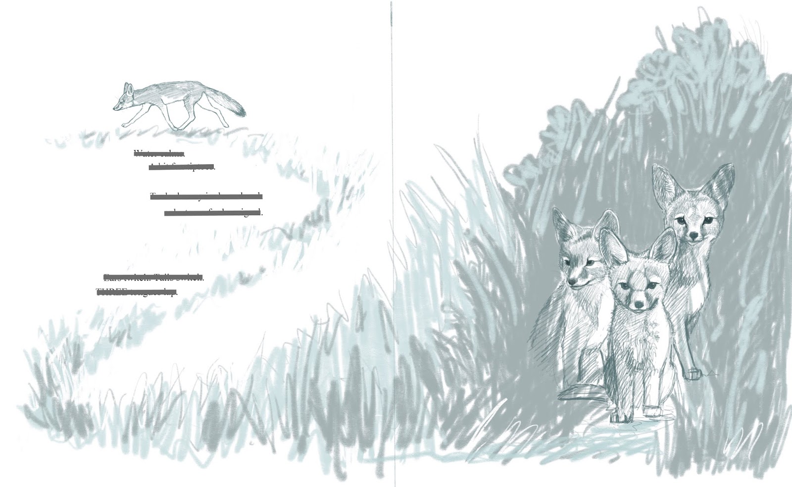
The first illustration I decided to tackle was the foxes. I figured even if the proposal was declined, I would still be left with a nice engraving for other purposes.


I didn't know much about the foxes, so I did lots of research for reference, finding images of the foxes themselves and of the habitat they lived in. In the original text the foxes were licking their lips, so I found a bunch of images of what animals look like licking their lips too.


I had the main idea already thumbnailed out, so it was a matter of refining that idea further. Here is the first proper sketch for it. 


The foxes were drawn in detail (digitally) and then the foliage was sketched quickly for the main shapes. I added the words to make sure it would all look nice together. I didn't have a size for the book yet, but chose a vertical layout, with average dimensions. 

I redrew the sketch onto my engraving surface and started carving away. The material for the illustrations for this book is high impact polystyrene (HIPS). It's relatively cheap (compared to wood) and softer to carve. Those two things became very important when the book was acquired, as I had to hand carve several layers for each illustration, in rapid succession.   

Here's a snapshot from my desk, carving away the first image. Below is the plate waiting to be proofed. 


After I cut and carved away most of the extra areas around the image. I hand burnished the image onto a smooth piece of paper (see below) and then went back to carving the plate again for the second image. 


This is the second image, printed from the same plate, after a second session of carving. 


The images were then scanned in at high resolution, and I went around and flipped it to a mirror image to match my thumbnail, and cleaned all the extra little markings away from around the main illustration. (When you print from a plate the image becomes mirrored, and often little raised areas around your image will also catch ink, and print little lines in the "wrong" places.)

Normally, in printmaking and trying to work into a signed edition, you would take the first image, and print it a bunch of times on nice pieces of paper, then go carve the plate some more and and print the same papers on the same spot again, for the second color. This is called a reduction cut, and is very time intensive, and can be a challenge to register and get the images to line up perfectly each time. If you mess up, there is no going back and printing extras, because the plate is destroyed as it gets carved more and more for each successive layer.

To speed the process up, I printed with black on separate pieces of paper, scanned them in, and layered them perfectly on the computer. I could also change colors easily, which would be next to impossible if I printed them traditionally.

Here you see the two layers composed on top of each other. This still seemed a bit plain for me, so for the proposal, I made some edits in Photoshop, to make the image into three colors.


This was the layers digitally broken into 3 colors.

Before submission, I also sketched in some detail the following page of otters to be included in our packet.  


Then our agent Essie, put it all together and sent it to the editor. 

And then we waited....

Find out what happens next, coming in part 2. 

Sunday, December 9, 2018

Debut picture book coming in 2019

I am sorry to have been so much absent. There are so many things I want to share monthly, but time is in short supply for me, and writing here always seems to be at the bottom of the list. I will try to get in the habit of posting more again. When I don't get to things right away, then there is never enough time to circle back to them later.

If you have been following me on social media, like instagram, twitter or facebook, you found out that I have my debut picture book coming out in March 2019 with Pomegranate. It's a beautifully written manuscript by Vivian Kirkfield, that I got to make wood engravings for. The book is an animal counting book that features endangered species and has great STEM material on the back about each animal featured in the book. 

Illustrating has always been a dream of mine, and with a lot of hard work and courage, that dream is finally coming true.
There were a lot of twists and turns in making sketches into wood engravings, into illustrations. I'll break down and share the whole process with you in the next few posts. There are a lot of steps to normal book illustration, but when you add the printmaking steps to it, you can't fit it into one post anymore. LOL

Right now we are getting promotional materials ready for the launch which happens in March-April 2019. The great coincidence is, that April 22 is also Earth day and the theme for 2019 is: "Protect our species". Our book fits snugly right in that theme! It works well for a wide age group and I hope lots of parents, libraries, schools and home schools will get lots of mileage out of it. (I'm also working on FREE work sheets, coloring pages etc to go with it...)

Please come back soon to see how the illustrations were made up close and personal.

Sunday, November 5, 2017

Woodlands Owl Illustration with Timelapse Video

This was every room in our house a couple weeks ago. Since opening boxes and getting our house somewhat functional, I have been trying to catch up on all manner of things.

One of the many things has been to finish illustrations for my new dummy about an unfortunate owl who can't keep her pets. I remembered to take some video of the process to share with you and wanted to chat during it to explain some of the process that I go through when making an illustration like this.


The nuts and bolts:

Paper: Legion paper, Stonehenge Aqua Coldpress 140lbs/300grm
Watercolors: Windsor & Newton, Daniel Smith, Yarka
Pencils: 2B mechanical pencil, and Derwent Studio color pencils
Brushes: sz 4 for most of it, sz 6 for bigger areas and sz 2 for a few details. No great quality brand name, just what I've gotten from Michaels.
Masking fluid: Schminke white masking fluid in 20ml bottle
Scanner: Epson Perfection V500 Photo Scanner
Printer: Canon Pixma Pro-100

The way I usually work illustrations is that I start with sketching in Procreate, on the iPad. When I finish a good draft, I paint in with approximate colors to resolve any conflicts that might arise later when painting the piece with watercolors.

After I have those two things resolved, I make a simplified line sketch in procreate, that I print out on watercolor paper at about 20% opacity. It's something I learned from Jake Parker's videos, and brilliant, because it takes the stress off from me from making mistakes in the painting. If I mess up with watercolors, I can print another drawing and paint again.


After the paper has been printed, I soak it in water and lay on my Gator board to stretch. If you look carefully, you can see the warping happening in the middle. After about 5 minutes, I flatten it out, and staple (just normal office stapler) it down around all the edges and leave it to dry until the next day. 


I like to paint my whole illustration in one sitting if at all possible. I get a feel for the colors I am using and how they apply, and when I have to stop in the middle and continue on a different day, it disrupts the flow. I choose a day both kids are gone, and have several hours of uninterrupted time. 

When you watch the video, you can see how I apply the paint, usually in layers, going darker each time, and bouncing around the paper, painting all the same colors in together. Below is an image of my painting set up. Nothing fancy, just basic stuff. On the top, half cut off, is my color sketch printed out, and a jar of brushes.  


Here is the time lapse video with chat of the painting process, with some comments on scanning and editing in Photoshop. 


Finished illustration with staples being picked out. 


And final illustration with edits in Photoshop. Most notably, the red line. I did not want to do it by hand, in any case that I draw it wrong and it has to be redone. 


Hope you enjoyed this little insight into my process. I should have another video to show soon and will be working on some new prints in the next few weeks. If you have any questions or comments about this post, just email me or comment below.