Showing posts with label intaglio. Show all posts

Monday, May 6, 2013

Smells like Summer... Finally!

Hi there! I am so glad that the weather is finally warming up and we are able to get outside a bit. Apparently this has been the grayest winter in Germany in over 50 years! We've paid for it by taking turns with Aila being sick since January it seems like. I have a little bit of a cough and runny nose left, but I think we are almost done with it all. Whew. I've been trying to play catchup with work all spring, and have gotten several pieces finished and done. My first wallhanging print is watercolored and waiting for some signatures- hopefully tomorrow. I'll write about that process later. Now before I run too far, I wanted to talk about the portfolio. We showed it at the MAPC conference in Cape Girardeau, and it was recently accepted into an exhibition in Finland in Tampere, but since they have not made the official announcement yet, I'll have to hold my tongue. I'm very excited about it though, and am currently matting all the prints, so they can be framed when we go to Finland mid-May.


I mainly wanted to post a lot of images of the prints in the portfolio and talk a little about each artist. I'll interview a couple, for some more in-depth stories. The theme of the portfolio was animal ABC's. We wanted to do a small portable set with artist working in different media, so that it would also function as a teaching tool. Each artist also contributed three prints, so that you can better see the style that they work in. I love multi functionality- our portfolio is like a little Swiss Army knife! Lets introduce our artists:

Letters A, B & C - Mirka Hokkanen


Hi, you know me. I chose to do wood engraving for my media. The images were engraved on resingrave blocks and printed on a proofing press. The artists that we chose for the portfolio all work with animal and nature themes, so printing animals for the portfolio was no leap for any of us.


The titles are Ant Eater, Bees in Bluebells and Cats.


Letter D, E & F- Seiko Tachibana
The titles are just the letters d, e, f. The media is drypoint and digital. Seiko is from Japan, and has completed degrees both in her home country and in the US. She currently works in California, and balances Asian traditions with minimalist modernity in her prints. 


Seiko writes: "I like to compare the marks, lines, shapes, colors, and textures that are the basic language of my work to living cells, and in the context of an individual block or panel, those cells come together to comprise an organ. When I assemble several individual works together, the blocks and panels then become like organs in a body, a body that is the whole of an artwork. In contemplating the similarities between biological structures and my work, I have discovered many different connections between ourselves and the universe in which we live."


Letters G, H & I - Curtis Bartone
Gabon Viper/Gas Explosion - aluminum plate litho, polymer plate 3 color litho and embossing
Hornet/Housing - aluminum plate litho, polymer plate 3 color litho and embossing
Iktomi/Incinerator - aluminum plate litho, chine colle, embossing 

I have interviewed Curtis already, and will be posting that for you shortly. Big fan of his work, and hope you'll love it too! So here's just a sneak preview.


Letters J, K & L - Chandler O'Leary
All prints are linocut, watercolor, cut out with calico fabric in the back. Here is a closeup of the letter J. All the paper inside of the image have been cut out and you can see the light blue flower fabric peeking through. 


Chandler works as a designer, illustrator and letterpress artist and I was so glad she agreed to be a part of our portfolio. I think we work from very similar inspirations and I love how she's able to incorporate "high" and "low" art in these beautiful accessible pieces. I always wonder how to do the same without  being too crafty. I have wanted to feature an interview of her for a long time and this will be a reason to finally do it. Before I get to it, you can go and visit her website here.  


Letters M, N & O - Inari Krohn
Morpho - etching, chine colle
Narwhal - etching, chine colle
Owl - etching, chine colle, wood cut


Inari is an established graphic artist in Finland and around the world. Her works are inspired by Finnish forests and the rhythms of tree branches against the changing skies. She is equally interested in the luminous painterly textures of Japanese woodcuts and the precise, delicate lines of intaglio. The quality and combinations that I see in her prints always capture and surprise me. I love seeing her work in galleries that I visit. Being moer established and having worked for so long, she has built the most amazing home studio which gives me something to aim for when we are done moving around. I look up to her in so many ways.  


Letters P, Q & R - Leo Lee
Pangolin v Polyp, Spotted Quoll v Queretaro Desert Snake, Rock Rat v Red Squirrel v Raccoon - all screenprint and watercolor. We asked Leo to make her set using screen printing. I was a little afraid of what you can do with screen printing on such a small scale, but she did not disappoint. These images are so intricate its hard to believe from afar that they are screen printed. They make an amazing example of how you can push the media. I love that she also incorporated some humor into our portfolio with her combinations of animals battling it out. 


Letters S, T & U - Sari Bremer
Snake and Tiger are three plate etching and aquatints and Unicorn is two. I learned about Sari's work from Inari. I had mentioned to her that we were looking for an artist who works in animal themes and uses acid etching techniques in her prints. Sari was the perfect fit, and it was nice to have another artist represented from Finland in our portfolio. 
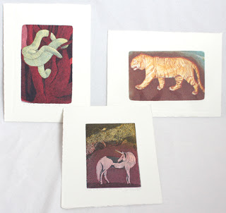


Here is what Sari writes about her work: "In my pictures I'm showing places where I've never physically been. The images are allegorical. Yet I wish them to also function on a purely visual level, each whole & complete in itself; tales that need not be interpreted. ... I want the viewer to experience through the images strange places, situations and phenomena. ... The subject matter changes and shifts freely from the stormy sea to the impenetrable jungle."


Letters V, W & X - Lari Gibbons

Vulpes Vulpes, Watersiphora Subtorquata, Xiphophorus Hellerii - all etching, letterpress and mezzotint. 
Lari is a friend whom I met when going to graduate school. She both teaches printmaking and directs the P.R.I.N.T. Press at UNT. I don't know how she manages her own time in the studio, but she is amazing and makes it work. 


We asked Lari to be in the portfolio, because she is well known for her intricate little mezzotints, and we wanted that technique to be in the portfolio as well. Lari helped us out even more, by adding letterpress to the prints, which no one else was featuring. Here is what Lari said about her pieces in the portfolio: "Because few common animal names begin with "v," "w" and "x" I looked to scientific names for a broader range of options. I also focused on invasive species--especially those that relate to the north Texas region where I live--so that the subjects would explore this overarching theme in my work. Lastly, I made reference photos and drawings at the Elm Fork Natural Heritage Collection at the University of North Texas. The labels that I incorporated in each design provide the common names of each species. 
I drew the subjects in a linear style that references technical drawing and illustration. I used mezzotint sparingly, adding subtle drop shadows around each of my subjects. Adding letterpress allowed me to show the relationship of each letter to the entire alphabet and to have a repeating visual element in each print. 


Letters Y & Z and the title page - Jon Lee
Both prints are hand made paper with watermark and woodcut, title page is letterpress. 
Jon Lee was the co-curator of our portfolio. We came up with the idea about 2 years ago while I was visiting San Antonio for the visiting artist program at Southwest School of Art and Craft. Jon is so creative and talented in a multitude of ways. He has excellent craftsmanship and I love visiting and seeing all the things he has made. His skill as a master craftsman is integral to the creative artist work, as you can see in the prints. Even though his work looks minimal, so much has gone into it in thought, labor and skill. It is very beautiful to behold. 


On another interesting note Jon is active in papermaking and printmaking research, adapting age-old traditions to contemporary uses. He is a native of South Korea and has worked as a professional printer for eight years, both in Korea and in the United States. Upon completing his Master Printer Training at theTamarind Institute of Lithography, he moved to Iowa to earn his MFA in printmaking at the University of Iowa. He currently works as a printmaker, papermaker and educator and is an Assistant Professor at Trinity University, San Antonio, Texas. 


I'm so happy to be a part of the portfolio. It was a great experience putting it together. I have Curtis' interview already in my mailbox and will post it shortly for you to enjoy!  

Saturday, October 29, 2011

Printing Intaglio Without a Press

If you are just starting out, a student or don't have the room for a nice press, printing intaglio work can be quite a challenge. I wanted to share a technique of pressless printing that I learned a long time ago from my friend, Margaret Craig, who teaches at the Southwest School or Arts in TX.

What you need are the normal things you would to print your plate + weights, transparent etching ink base and Golden Medium's Targel clear acrylic medium.

Here are some images of my quick setup at home. (You'll see I use some phonebook pages during plate wiping as well.)

In the picture above you can see the inks, targel (which you can get in smaller amounts), plates and plexi that I use to mix ink on. I chose a copper and zink plate from my old stash, the other has a deep aquatint on it and the other just a thin line etching. So you can use this technique for a wide variety of plates.

The picture below you can see my paper, cheap paintbrush, registration sheets and book that I used as weights.

To begin printing, wipe your plate like you normally would. If you have a lot of clear areas on your plate, in other words non-aquatinted areas, roll on a thin coat of transparent base so that your paper does not get glued to the plate. After the transparent base has been rolled on, paint on a thin even coat of Targel with a brush. Place the plate on your registration sheet, paper on top and layer some heavy things on top of it.

Tip- learned from Dan Welden's newsletter that instead of tarlatan, you can also use organze silk for wiping your etching plates. If you can get your hands on some, give it a whirl... Supposedly it lasts longer than tarlatan.

Back to printing- Let the plate dry for an hour or more, depending if you are in a humid or dry environment. We have really dry indoor air in Germany so dry time was a couple of hours. This is a good time to get a snack, do some exercises, watch an episode of your favorite tv show or go play with your baby/dog or husband.


After the acrylic has dried, you can peel the paper off the plate and the ink will stick to the paper. If you peel too soon, as I do in the video, the targel is still wet and will not completely adhere to the paper. When the acrylic is dry, the plate will peel off quite easily- be mindul of peeling your edges though. If you got targel around the edges, it might not start peeling and will tear instead.

The reason that the technique works is that the acrylic dries much faster than the etching ink. We are using Targel because it has "an extremely resinous, syrupy, stringy and tar-like consistency" as described on the Golden website. It's so sticky that it pulls the ink from the grooves of your etching plate when you separate the paper from the plate.


Now, this technique obviously is not the fastest in the world, it will take you anywhere from an hour or more to pull an image, but compared to no press at all, it is better than nothing. If you commit to print an edition this way, I would advise to store your ink under ceramwrap on a glass or plexi. You could also fold the mixed ink in foil/waxpaper and keep it in the fridge. I have not tried it, but you could maybe try to speed up the process by blowdrying the paper on the back to dry the acrylic faster.

Here are images of the cow print. You can see the edges have some paintbrush marks, where I did not paint the targel on very evenly, and the middle has a spot where the targel did not adhere to the paper. That could have been either because I peeled the paper off before the gel had dried or because there was no clear etching base on that spot and the gel adhered to the plate instead of the paper. Maybe even heavier weights would have solved the problem. Best thing is to do a couple of practice prints- carefully coating the plate and to figure out how long you need to dry the print before peeling the paper off the plate.
Here is a closeup of the same print. I printed the cow two times, so this is a different print compared to the one that you see in the video.


For another variation for the adventurous printers out there, you can also print on just the targel without paper. Do all the steps just as above, but paint a slightly thicker coat of targel on top. Leave the paper and weights off the plate and just let it airdry. When the targel is dry, you can peel the skin off the plate, with your printing ink attached to it. Now you have a transparent, stretchy print, that you can let dry like that, you can stretch it over things or distort it in other ways. Margaret has done so in some of her works, you can see an example here.

Troubleshooting.

If you get spots in your print after you peel it off, try adjusting these things:

Your targel had not dried yet. Clean off any targel remains from your plate and start again and let your plate dry longer. Your paper and plate should separate fairly easily when you peel them apart -always be careful around the edges.

You did not cover your plate evenly with the clear etching ink and the acrylic got stuck to your plate instead of the paper. Clean plate, ink your plate again and be careful to cover the whole plate evenly.

You did not cover cover the plate evenly with targel, and some of the ink remains on your plate. Clean plate, ink your plate again and be careful to cover the whole plate with an even coat of gel. Be careful not to gob it on too thick either.

There was an air bubble in between your paper and plate. Smooth paper on the plate starting from one edge.


I hope this posting has been interesting for you. If you get a chance to try it, I'd be happy to post some pictures or experiences from others as well. Or if you have a problem that needs solving, let me know. Next post, we'll look at my latest small engraving. :)

Saturday, March 19, 2011

Modifying Photopolymerplates with Acrylic Media

The moving day is inching closer by the hour. Moving trucks are rolling in first thing on Monday, and I have been organizing our house and the studio for weeks now. I have a couple of last minute things to complete before we head out. A couple of people are coming over tomorrow for a last minute photopolymer class and there are 6 huge panels that need to be finished up for a church commission. I have been taking some progress photos, and will post those after this moving madness is over.

Until then, I am pleased to feature a great article by Australian print-maker Annie Day. She has been a practicing artist since 1974, and is a passionate advocate of safer, healthier and more environmentally friendly printmaking techniques. A short plug- Annie and her sister Robin Ezra are teaching an exciting class in Florence, Italy, this summer. The 60 hour class covers the following safer printmaking techniques: waterless lithography, drypoint, monotype and collography. The class will be held at the world famous printmaking studio, Il Bisonte, where artists such as Picasso, Annigoni and Moore have worked. The workshop is suitable for any level of experience- you can find more information about it at their website here. I would love to go and take this class, the setting is ideal. (Maybe next year, since I'll be living a lot closer!)


Modifying Photopolymerplates with Acrylic Media
by Annie Day

Less than perfect polymerplates can be readily rectified by modifying the plate surface using acrylic media. A small section of the plate can be transformed, as in the example "Chamellia"; of for a more complete overhaul, the original plate may be covered in gesso and reworked.

Camellia before and after

The original plate was overexposed resulting in a loss of contrast between foreground and background (see before). This was easily recovered however, by adding pastel primer to the plate in the areas where more ink was required, resulting in a darker final print with better contrast (see after).

Method

-Wash the plate first, this will help the acrylic media to form a good bond with the surface. Clean the ink off the plate with vegetable oil, then using soft brush or cleaning mitt and a little detergent with water gently work the surface until all ink and greasiness is removed, rinse and dry with towel. Surface is now ready to apply acrylic media.

-Use various acrylic media: gesso, pastel primer, acrylic varnish, PVC glue, and gel medium for example. Art suppliers carry a huge range of these mediums and you may already have a few types.

-Carborundum or ground pumice mixed with or sprinkled onto gesso or PVC glue will give a finish with "tooth" for darker areas similar to the pastel primer used above in Chamellia.

- The medium can be painted, applied with palette knife or other implement and drawn into to create lines and textures.

- The surface can be built up by gluing a variety of low relief textural materials- such as paper or fabric using PVC glue, seal the surface with watered gesso or varnish.

-Once the desired finish is achieved, dry the plate thoroughly with a hairdryer or airdry over night at room temperature. To speed up the process use an oven at very low temperature, 50-60 Celsius, no higher or the plate may dry out too much and crack. The plate must be completely dry before inking to avoid paper sticking during printing.

- Apply ink with a short stiff brush, wipe with a small flat piece of tarlatan and finish with paper wipe. Buy cheap flat bristle brushes and cut bristles with scissors.

Plate being modified with pastel primer and gesso
Clear pastel primer was added for darker areas, and gesso thinned with water painted over the leaves.

Cicada
The sky in the print to the right was lightened using gloss varnish on the plate.
This print after was created after a visit to the Northern Territory, Australia, it tells the story of the great Rainbow serpent, Boulong, who lived in a deep waterhole, at Nitmiluk- named after the song of the cicadas.

Wash the plate with a soft brush or cleaning mitt in water to clean thoroughly. Gloss varnish, thinned with water, applied to sky areas to lighten. Keep the print nearby while you work and refer to areas that need change.

Fossil Fish
Before and after

Plate showing tissue glued to the surface with some thinned gesso and gloss varnish added over the paper. The fossil fish, Clibming Galaxis- live today in small pockets around the world. The fish has been in existence for millions of years. They are found in tiny streams leading to Manly Dam near my home.

The fish plate was too dark. I covered the background in PVC glue and attached tissue paper. A thin coat of gesso and thinned gloss medium were applied to the plate. In retrospect, the paper layer might have been more succesful if I had used crushed or textured paper and added gesso applied with palette knife for more interesting textural effects.

Notes:
- Art Spectrum Colourfix pastel primer was originally designed for coating surfaces in preparation for pastel drawing, but is a great medium for our puroses as it holds ink where the artist needs darker areas to print.

-Try experimenting with various acrylic media and pasting paper and textiles etc. The plate becomes a collagraph when you add media to the surface.

- Sometimes it is difficult to find where you need to apply the medium. Outline areas you are modifying in ballpoint pen. It makes it easier to see and will not show up in the final print.

Thursday, March 3, 2011

Horse printed and Craft fair


Greetings from rainy Dupont. Its been one of those on again/off again weeks with rain. We even had a nice little snowstorm a couple of weeks ago. It's been pretty amazing that every time I have taken our dog out for a walk, the weather has always been nice. God's pretty cool in the little things he does to bring sunshine in our day.

After arriving home from TX I had the Tacoma is For Lovers craft/art fair the very following weekend. I had time to sew a couple of things for one half of my table, and then I had prints on the other half. Here are a couple of shots from the very Valentine's day themed fair:


Here is what else I spied from around me. If you live in Tacoma area, the TIFL fairs are really worth making it to. The wares are affordable and there is so much variety. I will really miss going to them after our move. My table was next to Laurie Cinotto's. She has the most wonderful things made from paper. As a printmaker, how can I resist! Of course I did not take a picture of her table, but you can see her beautiful things at her website. I already had one pin, and had to splurge on another one as well. I also ended up getting a pair of earrings from Maija McKnight, who does equally beautiful jewelry (and who, of course, I did not get a picture of either...).


So after a busy week of sewing for the fair and unpacking after the trip, I got a chance to print the horse plate at a local high school with a small printshop. The press was a nice Conrad Machine press. Mental note, the day when I save enough money for my own nice press, make sure it has gear reduction drive in it. I was breaking a sweat and growing biceps like Paul Bunyan cranking the plate back and forth though the press 40x !

As you can see from the picture above, I was using a sheet of mylar for registration. That always works well for me. I have dried my prints by now, but am hesitating signing them, because I am not quite sure if I want to add watercolor in the effect of chine colle, and have a light yellowish background for the whole print area. I like the effect of setting the print apart from the border that way, but its a pretty big area to cover uniformly, so I can't decide if I can handle the agony of trying to manage it. Should have thought of it before I printed... We'll see.

I also took down the last exhibition I had in Kent last week. Now I have two more classes to teach and 10 more illustrations and I can finally pack my bags and move. We are having a lot of trouble because of Army bureaucracy, but I hope it will be ironed out in the next couple of days before it gets too late. I am still waiting for the interview I've been promising, but in the mean time I have a guest writer share some tips on polymerplate printing (intaglio style). Excited about that. Have a great week, Nappi (our dog) wishes you a happy early spring!


Thursday, February 10, 2011

San Antonio Print Crop

I have arrived back in Washington from Texas! It's good to be back home, my own bed, a loving husband, a terrific dog, home cooked meals and working in my own studio. I have the "Tacoma is For Lovers" craft fair at King's Books this weekend so I will try to get some sewing done for a change. Before I left for two weeks I had gotten some very nice Japanese fabrics to sew stuff from. Can't wait to get my hands on those.

Back to TX- The trip to San Antonio was a great deal fun. I finished 4 plates and printed 3 editions (the last one I'll have to print at home), I was able to talk to over 10 classes about what I do as printmaker, help some students become better at printing and see some old friends and spend time with them. How can it get any better than that. The first print I finished was that two color reduction linocut (see previous post). For the second color I mixed a dark brown ink and printed that on top of the first lighter brown. It looked good so I went ahead and printed the edition.

Here is how it turned out, it is printed on Fawn colored stonehenge paper. The color is a light grayish brown. Below it is also a detail of one of the deer. I quite like the way this one turned out, but my favorite print from the trip is yet to come.


If you haven't been to TX, let me tell you they really do have lots of deer. I stayed over one of the weekends at a friends house, and they had a whole herd (?) of deer in their front yard. Here's the two last to leave, a mommy and it's baby. The deer were quite tame, we were really close, I only had a little point and shoot with me to take this picture with.

After finishing the first linocut, I had about 5-6 workdays left. I was not sure how long things would take, so I wanted to work on a mini etching. A friend suggested I do a print with an armadillo, since I was in TX, so I figured why not.

The plate was printed twice for this edition. First I inked it up with black and printed it as a regular line etching. Then after the whole edition was done, I went back and relief rolled a light beige color on and used a q-tip to clean out the armadillo and mouse and then that got printed on top of the line etching for the chine colle look-a-like effect. The plate measures about 2.5" tall. Should have put a quarter next to the piece...


So after finishing "Tank" I had a couple more days to work. I figured I would do another mini plate, with the leftover paper I had. (I brought my own paper to print on, so I knew not to overpack on the way down.) This little guy is about the same size as the armadillo. I was thinking of other ways animals could hassle humans as they fight to get their land back from sprawling suburbs (the current theme in my work) and thought of swallows- they live everywhere and I am always afraid one day one will miscalculate and I'll have a big gash in my head. So was born the Dive Bomber print. I gave him some war paint for the extra twist. Hope you like it. The red highlights and beige background color were added with watercolor. Both the armadillo and swallow are created with repeated line etches on top of each other to get the desired gradation from light to dark.


I had one more day in the print shop before I had to go. Now what, I am just about out of paper, and have no time to edition anything any more, but I am no one to just sit around and twiddle my thumbs... I figure since I've been working so hard, I can do what ever I want- and this time I felt like I just wanted to draw a horse.

The etching is based on a photo and drawing and it ended up taking the last work day (12hrs) in the studio. I wanted it to be an excellent piece as far as technique was concerned, since the subject matter wasn't necessarily very high-arty (I made up a new word!). We had visited a museum in San Antonio and I had learned of three woman printmakers- Beth Van Hoesen, Andrea Rich and Mary Bonner. All of them did splendid animal prints, and I was very inspired to make my own. I'll have to do some book reports on them soon. ;-) So here is the last proof of the horse, I called her Faithful, she looked like a good horse. I really liked how the plate turned out and hope to print the edition off of it in the following weeks when I can get on a press big enough somewhere. The plate is about 6"x8" and my little press at home won't print that.


This print uses both line etching and soft ground for the tonal values. You can see the lines in the detail, and the soft ground crayon-like lines in the highlight in the top left corner. All the prints I finished will eventually be in my Etsy store. If you can't wait or they would make a great gift for someone right now, just contact me and we can work it out.