Showing posts with label how to. Show all posts

Saturday, October 29, 2011

Printing Intaglio Without a Press

If you are just starting out, a student or don't have the room for a nice press, printing intaglio work can be quite a challenge. I wanted to share a technique of pressless printing that I learned a long time ago from my friend, Margaret Craig, who teaches at the Southwest School or Arts in TX.

What you need are the normal things you would to print your plate + weights, transparent etching ink base and Golden Medium's Targel clear acrylic medium.

Here are some images of my quick setup at home. (You'll see I use some phonebook pages during plate wiping as well.)

In the picture above you can see the inks, targel (which you can get in smaller amounts), plates and plexi that I use to mix ink on. I chose a copper and zink plate from my old stash, the other has a deep aquatint on it and the other just a thin line etching. So you can use this technique for a wide variety of plates.

The picture below you can see my paper, cheap paintbrush, registration sheets and book that I used as weights.

To begin printing, wipe your plate like you normally would. If you have a lot of clear areas on your plate, in other words non-aquatinted areas, roll on a thin coat of transparent base so that your paper does not get glued to the plate. After the transparent base has been rolled on, paint on a thin even coat of Targel with a brush. Place the plate on your registration sheet, paper on top and layer some heavy things on top of it.

Tip- learned from Dan Welden's newsletter that instead of tarlatan, you can also use organze silk for wiping your etching plates. If you can get your hands on some, give it a whirl... Supposedly it lasts longer than tarlatan.

Back to printing- Let the plate dry for an hour or more, depending if you are in a humid or dry environment. We have really dry indoor air in Germany so dry time was a couple of hours. This is a good time to get a snack, do some exercises, watch an episode of your favorite tv show or go play with your baby/dog or husband.


After the acrylic has dried, you can peel the paper off the plate and the ink will stick to the paper. If you peel too soon, as I do in the video, the targel is still wet and will not completely adhere to the paper. When the acrylic is dry, the plate will peel off quite easily- be mindul of peeling your edges though. If you got targel around the edges, it might not start peeling and will tear instead.

The reason that the technique works is that the acrylic dries much faster than the etching ink. We are using Targel because it has "an extremely resinous, syrupy, stringy and tar-like consistency" as described on the Golden website. It's so sticky that it pulls the ink from the grooves of your etching plate when you separate the paper from the plate.


Now, this technique obviously is not the fastest in the world, it will take you anywhere from an hour or more to pull an image, but compared to no press at all, it is better than nothing. If you commit to print an edition this way, I would advise to store your ink under ceramwrap on a glass or plexi. You could also fold the mixed ink in foil/waxpaper and keep it in the fridge. I have not tried it, but you could maybe try to speed up the process by blowdrying the paper on the back to dry the acrylic faster.

Here are images of the cow print. You can see the edges have some paintbrush marks, where I did not paint the targel on very evenly, and the middle has a spot where the targel did not adhere to the paper. That could have been either because I peeled the paper off before the gel had dried or because there was no clear etching base on that spot and the gel adhered to the plate instead of the paper. Maybe even heavier weights would have solved the problem. Best thing is to do a couple of practice prints- carefully coating the plate and to figure out how long you need to dry the print before peeling the paper off the plate.
Here is a closeup of the same print. I printed the cow two times, so this is a different print compared to the one that you see in the video.


For another variation for the adventurous printers out there, you can also print on just the targel without paper. Do all the steps just as above, but paint a slightly thicker coat of targel on top. Leave the paper and weights off the plate and just let it airdry. When the targel is dry, you can peel the skin off the plate, with your printing ink attached to it. Now you have a transparent, stretchy print, that you can let dry like that, you can stretch it over things or distort it in other ways. Margaret has done so in some of her works, you can see an example here.

Troubleshooting.

If you get spots in your print after you peel it off, try adjusting these things:

Your targel had not dried yet. Clean off any targel remains from your plate and start again and let your plate dry longer. Your paper and plate should separate fairly easily when you peel them apart -always be careful around the edges.

You did not cover your plate evenly with the clear etching ink and the acrylic got stuck to your plate instead of the paper. Clean plate, ink your plate again and be careful to cover the whole plate evenly.

You did not cover cover the plate evenly with targel, and some of the ink remains on your plate. Clean plate, ink your plate again and be careful to cover the whole plate with an even coat of gel. Be careful not to gob it on too thick either.

There was an air bubble in between your paper and plate. Smooth paper on the plate starting from one edge.


I hope this posting has been interesting for you. If you get a chance to try it, I'd be happy to post some pictures or experiences from others as well. Or if you have a problem that needs solving, let me know. Next post, we'll look at my latest small engraving. :)

Monday, August 8, 2011

Studio, Exhibition and Interview

I finally got a chance to sit down and write from in between illustrating and running the house. While I have been busy with my nose buried in the studio every week, my hedgehog engraving has been popular in Etsy Treasuries, here are a couple for you to see. They are all quite beautiful.

NEWS: My work is currently up in the real world at the Washington State Convention Center. The exhibition is titled PS 5 and it features prints by South Puget Sound artists Dorothy McQuistion, Bill Colby, Janet Marcavage, Ann Johnston-Schuster and me. The exhibition runs through Oct 23rd, so you have plenty of time to go see it. The address for the convention center is: Level 2 South Galleria, 800 Convention Place, Seattle, WA. Hours are 7am-10pm.

The other bit of news is that my work and an interview are also featured on the Printsy Blog. Its quite a fun little interview with pictures of prints for sale in my shop.

I love to browse the other entries on the blog on my free time. The whole site is devoted to printmakers who are on Etsy and the articles feature work from one end of the spectrum to the other. It is wonderful and encouraging to see how many talented printmakers are selling work in alternative venues outside of the traditional gallery system. I like galleries, but with the constant moving, I find it easier to sell online and though exhibitions.


Mentioned in the previous posts was that I had carved a place to work in our new house. My husband is the greatest, and let me take up half of our living room to use as a studio, with flat file, presses and equipment. Otherwise it would have had to go up two narrow flights of stairs, to the third floor, which was not the greatest option. I bought this white and orange retro bureau (see below) from a yard sale, that has a shelf that folds down to a writing table. It works perfectly in a small space to paint on. I have given myself a time limit to finish all the rest of the illustrations in the next two weeks. I have been painting or drawing just about every day for a couple of weeks now, and am seeing the light at the end of the tunnel. I only have 5 images to draw and paint.

So to illuminate the process, I took some pictures. When working on a book illustration with a character, you want it to look the same thoughout the book. Being towards the end of the book, I have a set way of painting the little wren that makes it much easier than in the beginning, when I was just getting to know the her. When working, the whole place looks like a big mess, since I spread other finished illustrations on the table next to me with the manuscript and reference images, so I can constantly look over to make sure colors look the same thoughout. I tidied it up for the picture a little bit...

I start by sketching on any sheet of paper that I have handy- normally I do have something better than a notebook though (but you never know when inspiration strikes). Here is a sketch for a 1/3 page illustration of the little wren sitting in her nest. I normally just keep drawing over and refining the sketch until it is they way that I want the final illustration to look. Then I trace the main lines on watercolor paper and start painting away.


How do I know what to draw for the book? I have gone over the manuscript with the author in the beginning. We talked about color themes, how she envisions the illustrations and what her expectations were. The text was also divided up to fit 1/4 - 1 page illustrations. The author had a general idea of what she wanted me to draw for each one but was open to suggestions and input from me. Throughout the process as I finished images, I sent them to her for approval. Sometimes I made suggestions on how to adjust the illustrations and sometimes she had some changes to make. So it has been a flexible process as we go along. The author I am working with is wonderful- she gives me a lot of freedom to interpret and if needed change the illustrations around. Working with such a great partner also makes me want to paint even better and make the book look absolutely beautiful. I can't wait for it to actually be finished.

I am painting borders for each page of the book. Below you can see how the finished nest illustration will look set on a page. The text is obviously missing, but it will go on the top and if needed slightly around the illustration.

Here is the beginning of another image. On the left you can see the manuscript with a quick sketch of my idea on it. The sketch for the illustration is in the middle. I just use watercolors to paint with and normally use a dark outline around the basic forms on the page.


Here is the little wren singing. I decided to flip her facing the other way to make her look more natural in the layout of the pages.

After I am done with the illustrations, they will all be scanned in with a high resolution. Then they'll be set within the borders. Everything will be imported to Adobe InDesign to put the illustrations together with the text and then the book will be ready for publishing! It has been a very exciting process, and I will keep you posted on when the book is ready. I don't want to give out too much information before it is all done.
So now you know how I work, not very glamorous, but it works and I would not want to do anything else! Next time I'll share a small intaglio printmaking tip from Dan Welden.

Saturday, July 16, 2011

Interview with Abigail Anderson

It is not often that I come across a new technique and a fresh point of view in printmaking. If anywhere, the SGC and MAPC conferences are great events to attend if have been lacking inspiration lately. Abigail Anderson's artwork caught my eye at the last MAPC Conference and I just had to share it with you. It's been an interview long promised, so I hope you will be as inspired as I was when I met her.

Abigail Woods Anderson is a Minneapolis- based artist and educator. She received her BA from St Olaf College in 1999 and currently works with the Walker Art Center's department of education and community programs. Abigail is also an instructor and member of the artist cooperative at Minnesota Center for Book Arts (MCBA) and made her curatorial debut there at the Lerner Binder Gallery this spring (a multidisciplinary exhibition What Follows What Came Before).

I was drawn to her work because of the detail that she was able to get with photopolymerplates and her hand drawn negatives. Here is what Abigail had to say about her technique: "What's striking about letterpress is that it is at once anachronistic and in vogue. Artists working in letterpress have a vast array of technologies (two millenia) at their disposal. What sets my technique apart from most contemporary letterpress practitioners is my preference for handmade, rather than digitally derived, negatievs to generate photopolymer plates. I thrive off the direct mark-making and problem solving ingenuity of DIY processes and analog materials. Occasinally, specific projects necessitate the facsimile quality that a computer affords, but usually my process is more akin to drawing and painting."
Degrees, detail

Abigail was great in sharing how she makes her negatives. Her basic technique is to paint a solid surface of India Ink with a foam brish on acetate and let it dry. Then you can use the scratching tool of your choice (x-acto knife, etching needle, sandpaper, wire brush, etc.) After you make the drawing you can expose your plate the way you normally would. I'd suggest making a couple of trial plates to get the exposure right.
Now, here is an image of one of Abigails negatives. You can see how much detail and fine lines she has. That is what was so mind blowing to me. I asked her what the trick is to keep the fine lines from washing away after exposure. Her reply was to keep the highly detailed areas close together, and then have the rest of the area open. If there was one little mark in the middle of a large open area, then it would wash away, but having the lines so close together keeps them "safe".

I asked Abigail to share some more of herself and her work with us:

How/when did you start letterpress?
I confess- I had no idea what letterpress meant when I signed up for a workshop at the MCBA in 2008. My first instructor was Allison Chapman and my first projects were entirely engrossing and overly ambitious. So I was compelled to continue coursework at MCBA by taking classes in advanced letterpress and polymer plate making. I knew I had the letterpress obsession once I noticed myself laying awake at night concocting letterpress projects. So, to satiate this creative impulse, I joined MCBA's Artist Cooperative which consists of artists making independently driven work in the book arts disciplines- papermaking, printmaking and book binding. In exchange for monthly dues, we get a host of benefits, not least which is access to MCBA's studio space and equipment.

Re-Embroidered II, letterpress, 7"x7", print above, detail below
For someone who has not seen your work, how would you explain it?
I think my artwork has a certain "telescoping inward" quality. While subjects vary, my prints and paintings consistently are small scale and highly detailed. The notion of making visual riddles- compositions held together by some kind of tension or enigma- has held my attention recently.

Strange Loop is a good example. I developed a resource about this painting that is a hybrid of an artist statement and statement of influence. Artist voice/Artist Choice was a project proposed and supported by my colleagues at the Walker, mnartists.org and the Minneapolis Institute of Arts. It invites artists to discuss their own work in relation to resources held by the Walker and/or Minneapolis Institute of Arts.

Shelf Fungus, letterpress & chine colle, 4"x2.5"
Do you work in any other media than polymerplates?
While I only discovered letterpress about three years ago, I discovered love for printmaking about 12 years ago in a college intaglio class. But graduating college meant saying farewell to a sophisticated studio. I scaled back to art forms that could be accomplished in a small apartment. For several years I worked in pencil, pen and ink, watercolor, and gouache. Now that I am invested in printmaking, those direct media still interest me but are on the back burner. Within the medium of letterpress, I use primarily polymer plate, but occasionally employ metal type.

Where do you get your inspiration from for themes and colors? Do you always work with nature themes?
I often work with nature themes, but over the years my approach has edged a bit more towards abstraction. Recently I completed two works relating to mathematical principles. {2, 3, 5, 7, ... 2203, 2207} and {2, 3, 5, 7, ... 1789, 1801} are meditations on the prime number sequence. These prints reference the work of mathematicians Stanislaw Ulam and Charles Sacks.

Nulla Dies Sine Linea, letterpress, detail above and print below
Any great plans for the future?
To be fair, this is less of a plan and more of an ambition, but I'd like to edition an artist book about water bears. Also (totally unrelated) this summer I've got what I'm calling my "Gutenberg gig". On Spetember 24-25 I will be demonstrating the use of a Gutenberg replica press at the Minnesota Renaissance Festival.

Other exciting things? This summer I have an experimental outdoors project called Open Phenology (science of how and when living things change over the seasons). I engage the public every friday in a meandering walk and conversation during which we identify species, hypothesize about our observations and share knowledge. Then I use a blog to keep records of our phenological observations (with a good dose of musings and non-authoritative content). Open Phenology is my contribution to the Walker Art Center's Open Field and Field Office. It's part of my bigger fascination with citizen science and the perils and powers of inviting non-scientists to be collaborators in scientific pursuits.

I fell in love with your prints, do you have any for sale?
My art is available at the Groveland Gallery in Minneapolis.

Minuend, letterpress, 8.5"x5", detail above and print below
Thanks so much for sharing Abigail!

Saturday, March 19, 2011

Modifying Photopolymerplates with Acrylic Media

The moving day is inching closer by the hour. Moving trucks are rolling in first thing on Monday, and I have been organizing our house and the studio for weeks now. I have a couple of last minute things to complete before we head out. A couple of people are coming over tomorrow for a last minute photopolymer class and there are 6 huge panels that need to be finished up for a church commission. I have been taking some progress photos, and will post those after this moving madness is over.

Until then, I am pleased to feature a great article by Australian print-maker Annie Day. She has been a practicing artist since 1974, and is a passionate advocate of safer, healthier and more environmentally friendly printmaking techniques. A short plug- Annie and her sister Robin Ezra are teaching an exciting class in Florence, Italy, this summer. The 60 hour class covers the following safer printmaking techniques: waterless lithography, drypoint, monotype and collography. The class will be held at the world famous printmaking studio, Il Bisonte, where artists such as Picasso, Annigoni and Moore have worked. The workshop is suitable for any level of experience- you can find more information about it at their website here. I would love to go and take this class, the setting is ideal. (Maybe next year, since I'll be living a lot closer!)


Modifying Photopolymerplates with Acrylic Media
by Annie Day

Less than perfect polymerplates can be readily rectified by modifying the plate surface using acrylic media. A small section of the plate can be transformed, as in the example "Chamellia"; of for a more complete overhaul, the original plate may be covered in gesso and reworked.

Camellia before and after

The original plate was overexposed resulting in a loss of contrast between foreground and background (see before). This was easily recovered however, by adding pastel primer to the plate in the areas where more ink was required, resulting in a darker final print with better contrast (see after).

Method

-Wash the plate first, this will help the acrylic media to form a good bond with the surface. Clean the ink off the plate with vegetable oil, then using soft brush or cleaning mitt and a little detergent with water gently work the surface until all ink and greasiness is removed, rinse and dry with towel. Surface is now ready to apply acrylic media.

-Use various acrylic media: gesso, pastel primer, acrylic varnish, PVC glue, and gel medium for example. Art suppliers carry a huge range of these mediums and you may already have a few types.

-Carborundum or ground pumice mixed with or sprinkled onto gesso or PVC glue will give a finish with "tooth" for darker areas similar to the pastel primer used above in Chamellia.

- The medium can be painted, applied with palette knife or other implement and drawn into to create lines and textures.

- The surface can be built up by gluing a variety of low relief textural materials- such as paper or fabric using PVC glue, seal the surface with watered gesso or varnish.

-Once the desired finish is achieved, dry the plate thoroughly with a hairdryer or airdry over night at room temperature. To speed up the process use an oven at very low temperature, 50-60 Celsius, no higher or the plate may dry out too much and crack. The plate must be completely dry before inking to avoid paper sticking during printing.

- Apply ink with a short stiff brush, wipe with a small flat piece of tarlatan and finish with paper wipe. Buy cheap flat bristle brushes and cut bristles with scissors.

Plate being modified with pastel primer and gesso
Clear pastel primer was added for darker areas, and gesso thinned with water painted over the leaves.

Cicada
The sky in the print to the right was lightened using gloss varnish on the plate.
This print after was created after a visit to the Northern Territory, Australia, it tells the story of the great Rainbow serpent, Boulong, who lived in a deep waterhole, at Nitmiluk- named after the song of the cicadas.

Wash the plate with a soft brush or cleaning mitt in water to clean thoroughly. Gloss varnish, thinned with water, applied to sky areas to lighten. Keep the print nearby while you work and refer to areas that need change.

Fossil Fish
Before and after

Plate showing tissue glued to the surface with some thinned gesso and gloss varnish added over the paper. The fossil fish, Clibming Galaxis- live today in small pockets around the world. The fish has been in existence for millions of years. They are found in tiny streams leading to Manly Dam near my home.

The fish plate was too dark. I covered the background in PVC glue and attached tissue paper. A thin coat of gesso and thinned gloss medium were applied to the plate. In retrospect, the paper layer might have been more succesful if I had used crushed or textured paper and added gesso applied with palette knife for more interesting textural effects.

Notes:
- Art Spectrum Colourfix pastel primer was originally designed for coating surfaces in preparation for pastel drawing, but is a great medium for our puroses as it holds ink where the artist needs darker areas to print.

-Try experimenting with various acrylic media and pasting paper and textiles etc. The plate becomes a collagraph when you add media to the surface.

- Sometimes it is difficult to find where you need to apply the medium. Outline areas you are modifying in ballpoint pen. It makes it easier to see and will not show up in the final print.

Wednesday, November 10, 2010

Linocut Registration Jig

I am sitting at La Familia Gallery in Seattle today, enjoying the sunshine through the window and the people passing through. As I have time to sit, I figured why not write. I have been promising the tell you about the registration jig for linocuts on my little proofing press, so here's the scoop.
The whole thing started out, when I printed a larger reduction cut and needed good registration for the two colors. I glued and taped the above cardboard registration together after looking at some different ways of registering on proofing and iron hand presses. I realized about 2/3 way through printing the first color that every time when I bumped my paper against the registration strip it moved a little. So all the prints until that point had a slightly different registration. Getting the second color printed on the same spot on those prints was pretty much impossible, hence a large amount of messed up prints. Note to self, let glue dry completely before using things for registration.

So- I needed something more permanent, than cardboard, glue and masking tape. Carving unmounted linoleum is also more comfortable (and cheaper) for me, so I wanted the registration to work for unmounted linoluem blocks. I started off with a piece of 3/4" thick plywood for the base for the registration jig. On top of it, I mounted a piece of mylar with 3M spray adhesive (great stuff). You can see the edges of the shiny mylar in the pictures since it was not as big as the piece of wood. I wanted the mylar on the wood to make it easier to keep clean and to be able to reuse the jig for a long time for different blocks. You can see on the press, I still had to shimmy the plywood higher with some cardboard (I used the backer boards from pads of newsprint).

After that I cut a piece of 1/8" plexi to cover the plywood. I made the plexi larger to accommodate larger sheets of paper and to make it easier to grab the top and flip it up when printing. The plexi also has a window cut into it so that it will drop down around the linoblocks nicely. The opening size depends on how large blocks you want to be printing and how much extra paper you want around your prints. I normally print about 2" borders on my prints, so the plexi frame is about 1 1/2"-3" thick all around.
Next thing was to get a piano hinge and cut it to the right length. I shaved a hair off the end of the plywood so that the plexi would lie flat after the hinge was attached. I used some epoxy glue and screws to attach the hinge to the plexi. The screws were longer and I cut the tips off with a dremel, after it was all put together. The whole thing looks a little ugly on the top, but it works, and so far has not broken down on me, 7 editions later.
Here are just a couple of closeup shots of the end. Sometimes it's helpful to have pictures from a couple of different angles...


Here is the jig being used. When printing multiple blocks, I would adhere them to the jig with a quick spritz of spray adhesive to the back of my linoblock, just enough to keep it in place but easily removable when I was done printing. For multiple colors, I drew around the block on the mylar with a sharpie so it could be placed in the exact same spot when I was done carving the second color. The plexi had a strip of cardboard taped to it. Both the cardboard and paper had center marks, so that paper could be aligned the same every time.


When rolling up with ink I flip the plexi up and rest it over the press roller. For printing, I flip it down to use the registration on it. Instead of wool felts to print, I use a rubber "felt" thats a free recycle from a local offset printing place. To help visualize, I have posted a video about printing reduction cuts. (See very bottom of blog post.)
Hope you have enjoyed this post, if you have other ideas for registration or questions, please write to me. I would love to hear from ya! Coming next is an interview with some one I met at the MAPC conference, I was very excited about her technique for polymerplates, and she agreed to share her work with us.


Wednesday, October 20, 2010

MAPC Conference


It has been such an exciting week. I just returned back from Minnesota from the Mid America Print Council Conference. It was well worth the trip. Every day was packed to the max with demos, lectures, exhibitions and of course hanging out with friends. One of my favorite things is the sheer amount of prints that you see in such a short amount of time. There is so much creativity out there and it is so much fun to see all the exciting ways in which printmaking media are being stretched. It will take me a while to digest all the things I learned and all the artwork I saw.
Before it gets too late, I wanted to share as much as possible with you, and then it'll all go to the back burner for slower processing. I uploaded the better photos to my flickr site so you can see exhibition and event photos there. I did not realize it until afterwards, that I didn't really take pictures of people, just all the exciting things I saw at exhibitions and events. But I am sure you'll get the gist of it.

So here are shorter and longer excerpts of demos and lectures. The first video is from the Moku Hanga demo by Preston Lawig. Some people stayed after the demo, and Preston showed us how the plastic plate prints compared to a traditional shina plywood. I had never seen this plastic used for printing before, so that was pretty cool. I am pretty sure it was high impact poly styrene. Someone correct me if I have that wrong.


The second video is from James Ehlers engraving in the 21st Century demo. He had some new engraving tools that I had never seen before, so those were pretty cool. I had to break the video down to 3 sections, you can get all of them on YouTube. I also learned a new way of transferrign images to plates. James demonstrates that in the third video. You print with a lazerprinter on parchment paper and then rub that on your plate. the image is transferred and then you heat it up to adhere it better on your plate. you could use a hot plate, a torch or even a lighter. I have to try that out now.


Here's two pictures of what a traditional and the newer model of an engraving tool look like. You can tell the older is bent and longer and the newer is straight and shorter. The newer one is also made with a really tough metal, so that it lasts longer, but on the down side (or up depending on the way you look at it) is that you need a diamond honing stone to sharpen it. You can buy the modern version of the engraving tool online for about $33.


One of the keynote speakers for the conference was the young artist Swoon. She had an excellent talk on Friday morning. I was running out of time on the camera, but wanted to capture at least a couple of bits of her talk. I have been a fan of her work for a while now, so it was awesome to see her in person and hear her talk about her work. There are two separate videos I loaded of her, so go to You Tube to see the other one.


The Unevenly Distributed panel was also a joy to listen to. They discussed how old and new techniques and print and mixed media works all combined together in the art making groups that they were parts of. There were books, collections of paraphernalia, audio components, and all kinds of things that these groups were incorporating with prints. It was very exciting!

The three groups work that were discussed were Florida State University's Small Craft Advisory Press, Preacher's Bisquits Books and Impractical Labor in Service of the Speculative Arts (ILSSA). All of these organizations have great websites with lots of resources. The panel chairs were Denise Bookwalter and Chad Eby, and members Kristen Merola, Tate Shaw, Emily Larned and Bridget Elmer.

The video is 6 parts long, here is the first one, and the rest of them are on You Tube on my channel as well.


Whew, and if you haven't seen enough about printmaking yet, how about some chine colle. You can't have a print show with some one doing chine colle. Here the technique is tackeld on the enormous scale by Cole Rogers and Zac Adams-Bliss from Highpoint Center for Printmaking. I don't know if I will ever settle down and have a chance to print anything this large, but their technique is worth noting. It is very accurate and easy enough to do. You will also get some pointers on how to make chine colle paste and efficient application even on tissue-thin papers. This demo also two parts, see the other one here.


Last there is a short video of the "Let the Machines do all the Work" demo with Robin Schwartzman. I missed most of it, but they did another short run at the end of their time slot. The beginning of her video has a quick shot from the art building court yard, where they were doing a print extravaganza. It was already winding down, but looked like a lot had been going on during the day. I missed some of the fun things going on, they had a printing system, where they put a bed over the print and you would pull the proof by jumping on the bed. The bed gets moved over, and voila, your print is done!


This is a lot of info to cram into one post. Hope you find something interesting in one of them, and consider coming to the next conference. The next print conference will be the Southern Graphics Council one in St. Louis in March 2011.

Oh, and before I completely space out, I added my new work to my website, www.mirkah.com. Just click on the new works tab...

Soon to follow, exhibition news, catalog for sale (oooooh) and upcoming events!

Friday, August 27, 2010

From Start to Finish


For some people it is a mystery what I do, and how a piece of art is created. I finally remembered to keep a camera on me, so here is a little story of how my latest print came to be.

I am currently working on illustrating a book, where the main character is a little Winter Wren. I have been doing some research on the bird and found an interesting tidbit of information that I wanted to share with people. I also wanted to practice drawing wrens before starting with illustrating. So that's where the idea came from.

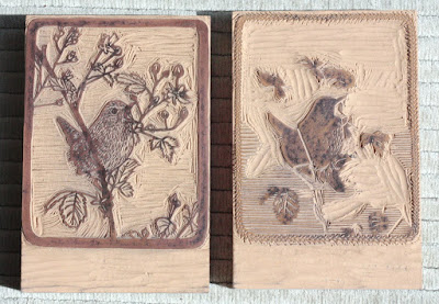
Making the Image and the Blocks. I looked through my own photos and through some online for reference for vegetation and birds. Then I had to figure out size- I wanted to make something small, so 4"x5" it was... I came with a sketch of the basic composition in my head, and then drew it out on a piece of paper as you can see on the left.

To make the print more interesting, I wanted to make it two colors. To figure out where colors should go, I transferred the original drawing on vellum, and then was able to trace the second color on top of it. When you layer them together you can get an idea of what the final print would look like.

I scanned the ink drawings on the computer, and printed them out on a lazer printer. The images were transferred to linoblocks as I described in my last blogpost. Where after I proceeded to carve them with linocarving tools.

Paper, Ink and Text. Next I figured out what size paper would be best to print on and proceeded to tear big sheets to the right size. For smaller prints, in general it looks nice to have at least two inches of white paper on each side of the printed area. I had to also figure out what colors I wanted to print with and mix ink accordingly. For the text, each letter had to be picked out of a drawer and set in the form you want them to print with. (Sorry I forgot to take a picture of that...)


Printing. I was very excited to print at the letterpress shop at SVC Seattle with an old school Chandler & Price press. It's amazing to think that this press was built about 100 years ago! Wish they built things like that today... For this wren print, I had to print on each sheet of paper three times- first the light color linoblock, then the dark color linoblock, and after that the text with the dark color also. The press also had to be cleaned for each color of ink to print.

Finishing the Edition. Lastly, I could bring my fresh prints home, go through them to toss out all the bad/ misregistered ones, clean out dirty marks and then sign and edition the rest of the prints that made it to the edition.

Now after that being read, aren't you excited about trying printmaking too! You might ask, why would you do that to your self, would it not just be easier to paint a picture. Well, yes and no. Sure, I can paint it, but I absolutely love the physical processes of printmaking. I love carving plates, being worn out after a day of printing, even the never ending challenges when things don't want to work out (trust me there are a LOT of glitches). And as icing on the cake, instead of just one painting at the end of the day, I have a set of prints, that I can sell more affordably, so that many more people can enjoy my art (for sale here).

I found a quote, that describes everything quite well:
"I must confess, I love my press.
For when I print, I know no stint
of joy."

I think I need to have that on a t-shirt...
Next post, I'll write about the last half of the letterpress class at SVC (ref. last posting) and the print that I made for it.
Till then, cheers!