Monday, May 6, 2013

Smells like Summer... Finally!

Hi there! I am so glad that the weather is finally warming up and we are able to get outside a bit. Apparently this has been the grayest winter in Germany in over 50 years! We've paid for it by taking turns with Aila being sick since January it seems like. I have a little bit of a cough and runny nose left, but I think we are almost done with it all. Whew. I've been trying to play catchup with work all spring, and have gotten several pieces finished and done. My first wallhanging print is watercolored and waiting for some signatures- hopefully tomorrow. I'll write about that process later. Now before I run too far, I wanted to talk about the portfolio. We showed it at the MAPC conference in Cape Girardeau, and it was recently accepted into an exhibition in Finland in Tampere, but since they have not made the official announcement yet, I'll have to hold my tongue. I'm very excited about it though, and am currently matting all the prints, so they can be framed when we go to Finland mid-May.


I mainly wanted to post a lot of images of the prints in the portfolio and talk a little about each artist. I'll interview a couple, for some more in-depth stories. The theme of the portfolio was animal ABC's. We wanted to do a small portable set with artist working in different media, so that it would also function as a teaching tool. Each artist also contributed three prints, so that you can better see the style that they work in. I love multi functionality- our portfolio is like a little Swiss Army knife! Lets introduce our artists:

Letters A, B & C - Mirka Hokkanen


Hi, you know me. I chose to do wood engraving for my media. The images were engraved on resingrave blocks and printed on a proofing press. The artists that we chose for the portfolio all work with animal and nature themes, so printing animals for the portfolio was no leap for any of us.


The titles are Ant Eater, Bees in Bluebells and Cats.


Letter D, E & F- Seiko Tachibana
The titles are just the letters d, e, f. The media is drypoint and digital. Seiko is from Japan, and has completed degrees both in her home country and in the US. She currently works in California, and balances Asian traditions with minimalist modernity in her prints. 


Seiko writes: "I like to compare the marks, lines, shapes, colors, and textures that are the basic language of my work to living cells, and in the context of an individual block or panel, those cells come together to comprise an organ. When I assemble several individual works together, the blocks and panels then become like organs in a body, a body that is the whole of an artwork. In contemplating the similarities between biological structures and my work, I have discovered many different connections between ourselves and the universe in which we live."


Letters G, H & I - Curtis Bartone
Gabon Viper/Gas Explosion - aluminum plate litho, polymer plate 3 color litho and embossing
Hornet/Housing - aluminum plate litho, polymer plate 3 color litho and embossing
Iktomi/Incinerator - aluminum plate litho, chine colle, embossing 

I have interviewed Curtis already, and will be posting that for you shortly. Big fan of his work, and hope you'll love it too! So here's just a sneak preview.


Letters J, K & L - Chandler O'Leary
All prints are linocut, watercolor, cut out with calico fabric in the back. Here is a closeup of the letter J. All the paper inside of the image have been cut out and you can see the light blue flower fabric peeking through. 


Chandler works as a designer, illustrator and letterpress artist and I was so glad she agreed to be a part of our portfolio. I think we work from very similar inspirations and I love how she's able to incorporate "high" and "low" art in these beautiful accessible pieces. I always wonder how to do the same without  being too crafty. I have wanted to feature an interview of her for a long time and this will be a reason to finally do it. Before I get to it, you can go and visit her website here.  


Letters M, N & O - Inari Krohn
Morpho - etching, chine colle
Narwhal - etching, chine colle
Owl - etching, chine colle, wood cut


Inari is an established graphic artist in Finland and around the world. Her works are inspired by Finnish forests and the rhythms of tree branches against the changing skies. She is equally interested in the luminous painterly textures of Japanese woodcuts and the precise, delicate lines of intaglio. The quality and combinations that I see in her prints always capture and surprise me. I love seeing her work in galleries that I visit. Being moer established and having worked for so long, she has built the most amazing home studio which gives me something to aim for when we are done moving around. I look up to her in so many ways.  


Letters P, Q & R - Leo Lee
Pangolin v Polyp, Spotted Quoll v Queretaro Desert Snake, Rock Rat v Red Squirrel v Raccoon - all screenprint and watercolor. We asked Leo to make her set using screen printing. I was a little afraid of what you can do with screen printing on such a small scale, but she did not disappoint. These images are so intricate its hard to believe from afar that they are screen printed. They make an amazing example of how you can push the media. I love that she also incorporated some humor into our portfolio with her combinations of animals battling it out. 


Letters S, T & U - Sari Bremer
Snake and Tiger are three plate etching and aquatints and Unicorn is two. I learned about Sari's work from Inari. I had mentioned to her that we were looking for an artist who works in animal themes and uses acid etching techniques in her prints. Sari was the perfect fit, and it was nice to have another artist represented from Finland in our portfolio. 
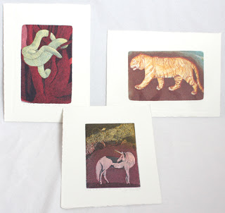


Here is what Sari writes about her work: "In my pictures I'm showing places where I've never physically been. The images are allegorical. Yet I wish them to also function on a purely visual level, each whole & complete in itself; tales that need not be interpreted. ... I want the viewer to experience through the images strange places, situations and phenomena. ... The subject matter changes and shifts freely from the stormy sea to the impenetrable jungle."


Letters V, W & X - Lari Gibbons

Vulpes Vulpes, Watersiphora Subtorquata, Xiphophorus Hellerii - all etching, letterpress and mezzotint. 
Lari is a friend whom I met when going to graduate school. She both teaches printmaking and directs the P.R.I.N.T. Press at UNT. I don't know how she manages her own time in the studio, but she is amazing and makes it work. 


We asked Lari to be in the portfolio, because she is well known for her intricate little mezzotints, and we wanted that technique to be in the portfolio as well. Lari helped us out even more, by adding letterpress to the prints, which no one else was featuring. Here is what Lari said about her pieces in the portfolio: "Because few common animal names begin with "v," "w" and "x" I looked to scientific names for a broader range of options. I also focused on invasive species--especially those that relate to the north Texas region where I live--so that the subjects would explore this overarching theme in my work. Lastly, I made reference photos and drawings at the Elm Fork Natural Heritage Collection at the University of North Texas. The labels that I incorporated in each design provide the common names of each species. 
I drew the subjects in a linear style that references technical drawing and illustration. I used mezzotint sparingly, adding subtle drop shadows around each of my subjects. Adding letterpress allowed me to show the relationship of each letter to the entire alphabet and to have a repeating visual element in each print. " 


Letters Y & Z and the title page - Jon Lee
Both prints are hand made paper with watermark and woodcut, title page is letterpress. 
Jon Lee was the co-curator of our portfolio. We came up with the idea about 2 years ago while I was visiting San Antonio for the visiting artist program at Southwest School of Art and Craft. Jon is so creative and talented in a multitude of ways. He has excellent craftsmanship and I love visiting and seeing all the things he has made. His skill as a master craftsman is integral to the creative artist work, as you can see in the prints. Even though his work looks minimal, so much has gone into it in thought, labor and skill. It is very beautiful to behold. 


On another interesting note Jon is active in papermaking and printmaking research, adapting age-old traditions to contemporary uses. He is a native of South Korea and has worked as a professional printer for eight years, both in Korea and in the United States. Upon completing his Master Printer Training at theTamarind Institute of Lithography, he moved to Iowa to earn his MFA in printmaking at the University of Iowa. He currently works as a printmaker, papermaker and educator and is an Assistant Professor at Trinity University, San Antonio, Texas. 


I'm so happy to be a part of the portfolio. It was a great experience putting it together. I have Curtis' interview already in my mailbox and will post it shortly for you to enjoy!  

Tuesday, February 5, 2013

February- Already!

It feels like the months are flying by one faster than another. Since my last post we moved to a new house and have been travelling almost non-stop. I've needed January just to recoop and collect my thoughts for a fruitful (winter and) spring.


Before November I was on a crunch to finish three engravings for a portfolio that Jon Lee from San Antonio and I were organizing. The theme for the portfolio was animal ABC's. We selected 9 talented artists who worked in different media from around the world who worked with nature themes and asked them to create three letters. It turned out so great I'll have to write a separate post on the whole portfolio and introduce all the artists and their work. Below- Lari Gibbons and me posing infront of our portfolio at the MAPC conference.

The portfolio was exhibited at the Mid America Print Council conference in Cape Girardeau, Missouri in November. I was able to participate to see our beautiful portfolio on the wall and speak in the "Craft and Collaboration: Printmaking Outside of Academia" panel. It was great to share my experiences with students through the talk, get a chance to connect with friends and be around people who shared my passion. Living in a country town in Germany is not giving a lot of opportunities to hang out with printmaking peers. BTW Pinteresting has a lot of great articles from the conference if you missed it. If I get a chance, I'll try to post some thoughts too, even though it will be waaaaay late.

News- several prints are featured in a couple of ongoing shows. First the Wood Engravers Network exhibition has moved to Westville Gallery in New Haven, CT. It will be up until Feb 22nd, and then move to Seattle Visual Concepts, WA from 2/20-6/5/13 and Randolph County Community Arts Center in Elkins, WV from 7/1-8/22/13. One of my pieces was accepted into the Mid America Print Council Juried Show which is up at the McDonough Museum of Art at Youngstown State University, Youngstown, OH. That exhibition will be up until March 15th. If you're around go check them out. I am also working to update the Etsy store with the three new ABC prints.

During Christmas break we took a trip to Finland to see my family. We stayed for two weeks and I was able to squeeze several interviews after the holidays were over for the wallhaning project. I was able to listen to first hand stories of how life was before the wars from a elderly lady and talk to people about handcrafts their mothers or grandmothers had done. The project was also featured in a newpaper article and through that I have had about five contact requests with people who have old wallhanings and have memories about them to share.

In January my 16 month daughter started part time day care, which frees up some hours each week for catching up on printing and sewing. I am working on finishing up the editions for the ABC portfolio and some graphic design work for a friend in Finland. As soon as all that is finished, I look forwards to heading up with the first prints for the wallhanging project. My goal is to finish at least three prints for it this year. The first one is a little daunting to begin since I am still playing around with ideas how to translate the old handembroidery tradition to printed form. I'll just have to jump in and adjust as I go along.

I promise it wont take half a year to write again. ;) The ABC portfolio is still fresh in my mind and it was such a success- I can't want to share it with you. Have a great week!

Friday, June 22, 2012

The Bather - Story of a Reduction Linocut

Summer is finally here with a wiff of ink and rustling of paper from my studio. Aila has done a great job at keeping me busy, but I managed to sneak in some time in the studio and finish this lovely bunny print. I've been working on it since before she was born 9.5 months ago, and feel so accomplished to finally have it done. Whew!
Since it was a long time in the making and reduction prints are generally more complicated, I wanted to share with you how it was printed and some tips how to make your life easier when printing reduction cuts. It's not the first reduction linocut post I am doing, but you always learn new tricks to solve problems. I managed to even put together a two part video of the whole process! 
  
Just a quick update on whats been happening in our lives before we jump into printing. Aila has been a great source of joy and laughter to us even with ear infections, heart surgery and keeping me up every night for a month now. She had surgery to repair a hole in her heart and now that it is done, she has been very active and curious and even learned to crawl yesterday. 

As far as studio news, I wrapped up shows in Seattle and Turku and have an ongoing show at the Asheville Bookworks- Wood Engravers Network Juried Show. The next opening will be at Galleria G on Jun 27, 2012. The exhibition runs until Jul 20th and offers a great selection of contemporary Finnish prints. On the illustration front- I completed watercolors for a children's book about a little singing wren several months ago. The book is finally being printed this week and I should have copies at our house in a couple of weeks. So exciting! I'll post some images of that when we get back from our trip to Finland in August.  

And now for your daily dose of printmaking.


I got the inspiration for the print from a photo of a rabbit grooming itself from Wetcanvas.com (great resource for candid copyright free shots). The round shapes, red color and jutting ears were irresistible to me. They just begged- print me, print me! Incidentally, I had also aquired a new press, the Korrex Stuttgart (just Stu between friends) and wanted to test the limits of what I could do with it right off the bat. The size of the paper is the largest I can fit through (11.5x15") and getting large flat areas to print evenly were a challenge too. The printed area measures about 12x9".

Here is the first video that shows carving and printing the first color:


The biggest issue I had with te first color was that it was printing horizontal rollermarks on the paper. Since it was the first color and most of it was going to be hidden under the successive colors it was not a huge issue, but it needed to be fixed for the next colors. The fix was rolling forwards and then back a little bit before going all the way to the end. You see me doing it every time I print. It only took me about 40 prints to figure that out! I also had a lot of issues with the plate not printing evenly, but that was fixed in general with some strips of paper under the plate. I find that a lot of times when printing linoleum and resingrave plates attached to this kind of board the plates change during printing and need to be spot-filled with paper underneath as I go. Guess there is just a little bit of give in parts of the wood that is squeezed in during printing. Here is an image of all the first color prints drying pretty after a night of printing.


Here is the second video with the rest of the steps to complete the print. I hope it is fairly self explanatory. Please let me know if you have any questions.


The first two colors printed.


The first two colors went over pretty well. I had a booboo in the middle of my run, where I had originally adjusted my plate and forgot to push it all the way to the right. So half of my prints were 1/8" to the left compared to the other half. This caused several misregistered prints before I figured it out... It should go without saying, make sure your plate is in place before you lock it up after you've been stuffing the underside.

Since reduction cuts are a tricky business and I did not want to ruin any nice prints by proofing successive colors on them, I had to figure out how to see what the next color looks like on the print without actually printing on it. Thanks to a large piece of mylar that I normally use to register my etchings with, I was able to solve that problem. I rolled up the plate with ink, and printed it the mylar and then was able to fit the mylar over one of the prints to see what it looked like. I was glad I did that, since the plate needed some more carving.

Below is the third color being proofed. The first state is on the left. You can see how much darker it is in areas, and after proofing, I went back and carved some more areas out. At that point I also resolved to make a 4 color reduction cut instead of 3. The Black was too harsh on the first two colors and the image needed another middle brown to soften it.


Why am I so stingy with my prints? When you do a reduction cut, you destroy the plate by carving it a little bit more every time you print. So I started by printing about 90 images, and every time one was misprinted, it was one less for the final edition. I can't go back and print the first colors any more because the plate for it does not exsist anymore. In the end I had about 50 good ones left. 

Rolling the last state up by hand for mylar proofing.


Last color on mylar by itself.


Fitting the mylar over a print to see how it looks. 


All done and ready to print. It was really exciting to shuffle the mylar on the image and see how the final print was going to look.


For the last color, it seemed like every other one of the prints were slightly off register. (Thanks to my booboo in the first round and insisting on printing on deckled edge paper.) To fix that, I cleaned the mylar off and printed the final color on it again but this time well registered. So now I was able to position the mylar on the feedbed and the printable paper underneath it. Register the prints there, remove mylar and then print. This was more time consuming, but after all the hard work I put into it, I did not want to mess up half of the remaining prints. Next time I'll be sure to have clean edges and make sure the plate stays in one place...

Here are the last two colors side by side. You can see how the extra layer of black really punched it out.


The final state and a detail underneath it. 


I hope you enjoyed seeing how the print was made. I love the way the fur turned out and the colors too. I find carving *very* therapeutic and look forwards to working on some engravings and more problemsolving as printing commences. Miss bunny is titled "The Bather" and prints are now available for sale on Etsy. Have a great day!

Friday, March 23, 2012

Engraving on an Etching press

I have emerged from motherhood to write again! Our daughter Aila is growing fast and is already learning to eat solids. I figured it is appropriate to finally post about the firefly engraving half a year later, since I was printing it a week or so before she was born. Better late than never...

Below is a little shot of the resingrave block with the DIY sandbag and tools. I had bought the thinner blocks to see if they would be easier to print on the etching press than the thick ones on the letterpresses. The verdict- both were just as easy/challenging. Here is a short story on printing engravings on an etching press.


So I am printing this edition about 8mo + pregnant. Hence sitting down while rolling the plate up. I've got my ink and brayer set up and am using two pieces of unmounted linoleum taped to a plexiglass to guide the roller on the edges.

I was having trouble at first with the paper lying down on the plate and stretching slightly as it went under the roller. Large areas of black would have stretch marks and the end of the plate smeared. You can see it in the close-up below.


So to fix that problem I ended up using the same technique as in the reduction linocut prints I did in San Antonio. Two pieces of foam on either side of the plate holding the paper up until it goes under the roller. Below- setting the plate down and then the paper.


Above- laying the paper down on the press bed. I am running the plate to the right under the roller. The foam is at the back end of the paper going through.

Having the two foam pieces worked great and the prints came out nice and clean after that. Instead of a felt blanket I am using a rubber offset printing blanket. It works well for all kinds of relief printing so you don’t get too much pressure like you do with the wool felts.

Running the print through the press and revealing the print on the other side.


TaDah! Here is a closeup of the print and paper size. The print was done to be a part of the Inkteraction 2011 "Navigating the Currents: 100 Inkteraction Reactions" portfolio. I figured it was one of the last things I could do before the baby came and I would have time to work on it. The portfolio has been touring TX in the beginning of the calendar year and heads to Macon, GA in April. The schedule of exhibitions can be seen here: Inkteraction. The administrators of Inkteraction asked 100 members to volunteer their interpretation of how Inkteraction helps the contemporary printmaker to navigate the electronic currents of the web. The way I see Inkteraction working is kind of like seeing fireflies in the night. They are spread out lighting up all over the place- kind of like our presence on the web- we are here and a moment later offline doing our own thing. It is a very splintered way to interact with people, but through it we find each other, see each others work and then when we meet face to face we are able to recognize each other and build more meaningful relationships.
I'm pretty happy with the way the print turned out, the only thing I'd change would be to work on a deeper black that does not have any white dots in it.

Adios amigos, be back soon with info on two upcoming exhibitions and other things I have been up to!


Saturday, October 29, 2011

Printing Intaglio Without a Press

If you are just starting out, a student or don't have the room for a nice press, printing intaglio work can be quite a challenge. I wanted to share a technique of pressless printing that I learned a long time ago from my friend, Margaret Craig, who teaches at the Southwest School or Arts in TX.

What you need are the normal things you would to print your plate + weights, transparent etching ink base and Golden Medium's Targel clear acrylic medium.

Here are some images of my quick setup at home. (You'll see I use some phonebook pages during plate wiping as well.)

In the picture above you can see the inks, targel (which you can get in smaller amounts), plates and plexi that I use to mix ink on. I chose a copper and zink plate from my old stash, the other has a deep aquatint on it and the other just a thin line etching. So you can use this technique for a wide variety of plates.

The picture below you can see my paper, cheap paintbrush, registration sheets and book that I used as weights.

To begin printing, wipe your plate like you normally would. If you have a lot of clear areas on your plate, in other words non-aquatinted areas, roll on a thin coat of transparent base so that your paper does not get glued to the plate. After the transparent base has been rolled on, paint on a thin even coat of Targel with a brush. Place the plate on your registration sheet, paper on top and layer some heavy things on top of it.

Tip- learned from Dan Welden's newsletter that instead of tarlatan, you can also use organze silk for wiping your etching plates. If you can get your hands on some, give it a whirl... Supposedly it lasts longer than tarlatan.

Back to printing- Let the plate dry for an hour or more, depending if you are in a humid or dry environment. We have really dry indoor air in Germany so dry time was a couple of hours. This is a good time to get a snack, do some exercises, watch an episode of your favorite tv show or go play with your baby/dog or husband.


After the acrylic has dried, you can peel the paper off the plate and the ink will stick to the paper. If you peel too soon, as I do in the video, the targel is still wet and will not completely adhere to the paper. When the acrylic is dry, the plate will peel off quite easily- be mindul of peeling your edges though. If you got targel around the edges, it might not start peeling and will tear instead.

The reason that the technique works is that the acrylic dries much faster than the etching ink. We are using Targel because it has "an extremely resinous, syrupy, stringy and tar-like consistency" as described on the Golden website. It's so sticky that it pulls the ink from the grooves of your etching plate when you separate the paper from the plate.


Now, this technique obviously is not the fastest in the world, it will take you anywhere from an hour or more to pull an image, but compared to no press at all, it is better than nothing. If you commit to print an edition this way, I would advise to store your ink under ceramwrap on a glass or plexi. You could also fold the mixed ink in foil/waxpaper and keep it in the fridge. I have not tried it, but you could maybe try to speed up the process by blowdrying the paper on the back to dry the acrylic faster.

Here are images of the cow print. You can see the edges have some paintbrush marks, where I did not paint the targel on very evenly, and the middle has a spot where the targel did not adhere to the paper. That could have been either because I peeled the paper off before the gel had dried or because there was no clear etching base on that spot and the gel adhered to the plate instead of the paper. Maybe even heavier weights would have solved the problem. Best thing is to do a couple of practice prints- carefully coating the plate and to figure out how long you need to dry the print before peeling the paper off the plate.
Here is a closeup of the same print. I printed the cow two times, so this is a different print compared to the one that you see in the video.


For another variation for the adventurous printers out there, you can also print on just the targel without paper. Do all the steps just as above, but paint a slightly thicker coat of targel on top. Leave the paper and weights off the plate and just let it airdry. When the targel is dry, you can peel the skin off the plate, with your printing ink attached to it. Now you have a transparent, stretchy print, that you can let dry like that, you can stretch it over things or distort it in other ways. Margaret has done so in some of her works, you can see an example here.

Troubleshooting.

If you get spots in your print after you peel it off, try adjusting these things:

Your targel had not dried yet. Clean off any targel remains from your plate and start again and let your plate dry longer. Your paper and plate should separate fairly easily when you peel them apart -always be careful around the edges.

You did not cover your plate evenly with the clear etching ink and the acrylic got stuck to your plate instead of the paper. Clean plate, ink your plate again and be careful to cover the whole plate evenly.

You did not cover cover the plate evenly with targel, and some of the ink remains on your plate. Clean plate, ink your plate again and be careful to cover the whole plate with an even coat of gel. Be careful not to gob it on too thick either.

There was an air bubble in between your paper and plate. Smooth paper on the plate starting from one edge.


I hope this posting has been interesting for you. If you get a chance to try it, I'd be happy to post some pictures or experiences from others as well. Or if you have a problem that needs solving, let me know. Next post, we'll look at my latest small engraving. :)