Sunday, November 5, 2017

Woodlands Owl Illustration with Timelapse Video

This was every room in our house a couple weeks ago. Since opening boxes and getting our house somewhat functional, I have been trying to catch up on all manner of things.

One of the many things has been to finish illustrations for my new dummy about an unfortunate owl who can't keep her pets. I remembered to take some video of the process to share with you and wanted to chat during it to explain some of the process that I go through when making an illustration like this.


The nuts and bolts:

Paper: Legion paper, Stonehenge Aqua Coldpress 140lbs/300grm
Watercolors: Windsor & Newton, Daniel Smith, Yarka
Pencils: 2B mechanical pencil, and Derwent Studio color pencils
Brushes: sz 4 for most of it, sz 6 for bigger areas and sz 2 for a few details. No great quality brand name, just what I've gotten from Michaels.
Masking fluid: Schminke white masking fluid in 20ml bottle
Scanner: Epson Perfection V500 Photo Scanner
Printer: Canon Pixma Pro-100

The way I usually work illustrations is that I start with sketching in Procreate, on the iPad. When I finish a good draft, I paint in with approximate colors to resolve any conflicts that might arise later when painting the piece with watercolors.

After I have those two things resolved, I make a simplified line sketch in procreate, that I print out on watercolor paper at about 20% opacity. It's something I learned from Jake Parker's videos, and brilliant, because it takes the stress off from me from making mistakes in the painting. If I mess up with watercolors, I can print another drawing and paint again.


After the paper has been printed, I soak it in water and lay on my Gator board to stretch. If you look carefully, you can see the warping happening in the middle. After about 5 minutes, I flatten it out, and staple (just normal office stapler) it down around all the edges and leave it to dry until the next day. 


I like to paint my whole illustration in one sitting if at all possible. I get a feel for the colors I am using and how they apply, and when I have to stop in the middle and continue on a different day, it disrupts the flow. I choose a day both kids are gone, and have several hours of uninterrupted time. 

When you watch the video, you can see how I apply the paint, usually in layers, going darker each time, and bouncing around the paper, painting all the same colors in together. Below is an image of my painting set up. Nothing fancy, just basic stuff. On the top, half cut off, is my color sketch printed out, and a jar of brushes.  


Here is the time lapse video with chat of the painting process, with some comments on scanning and editing in Photoshop. 


Finished illustration with staples being picked out. 


And final illustration with edits in Photoshop. Most notably, the red line. I did not want to do it by hand, in any case that I draw it wrong and it has to be redone. 


Hope you enjoyed this little insight into my process. I should have another video to show soon and will be working on some new prints in the next few weeks. If you have any questions or comments about this post, just email me or comment below. 

SCBWI 2017 Los Angeles Conference

As a quick update, before digging into the conference, I wanted to mention that we have finally moved and I am starting to work out of my new studio again. We've been in flux since May, and it is nice to sit in my own chair again and get the gears moving slowly. I wish I would have had time to post this sooner, but things are never perfect, so its better late than never right? I'll have a mini post with a link to a timelapse video of my latest illustration and hopefully will have some new prints to show before Thanksgiving. If you haven's signed up for my mailing list, that is the best place to hear about all the latest prints available for sale. (Sign up here => "Newsletter" in right column)

Back to the main topic of this post:

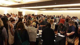
I was fortunate to attend the latest SCBWI conference held in LA this July. This was the first large SCBWI conference I’ve attended and think that it was well worth my time to go, especially as a newbie to the industry. The LA conference, from what I hear, is a more relaxed atmosphere and there is more of a chance to meet your peers. I think it is a great conference to go to, especially if you are just beginning, because you can hear professionals talk about their experiences, attend mini workshops and bond with peers who are in various stages in their careers. I felt like at least half the attendees were close to me, still waiting to publish their first book. I think a lot of the breakout sessions were also geared and very helpful to new author/illustrators, and I got something from each one that I went to. My regret is that I wasn’t able to be in more than one spot at the same time, to listen in on all the great lectures. I took lots of notes, and it’ll take me a while to go through them to sort all the information out.


There were so many highlights at the conference. The first was being able to connect in person with friends I had made on Facebook in my writing groups. I got to know many of them better, as we sat together for panels, lunches and coffee. My two roommates, whom I had met in an online class, became life-long friends, and as a bonus, sharing a room really helped bring the conference cost down. Left: Us roomies all alumni of Arree Chung's (right) Storyteller Academy.

Second, I got to meet Leuyen Pham, author/illustrator. I love her style and humor and went to all three of her events. My favorite was her session “Creating Middle Grade Art”. She has illustrated a wide variety of middle grade books, and her insights on how to choose the subject matter, working with art directors and differences between chapter books for early readers and middle grade novels were eye opening. She also has a very similar way of working to me, which made me identify with her the a lot.

Third, I wanted to highlight the breakout session with Tammy Sauer. Her session was titled “Picture Book Writing Secrets - Revealed!”. Her talk was also very informative, and extremely entertaining and she was a speed talker. I did my best to take notes, but still havent gone over everything and organized it all. She had so many good ideas on how to make stories more funny, interesting, organized, how to escalate events, play with readers expectations, different types of hooks etc. She was the most animated speaker I’ve seen at a conference, and it was fun to be there for the ride, even though my hand hurt from taking notes and my ears were ringing afterwards.

Some of my tips for a new illustrator attending this conference would be, first, to take breaks when you need them. The days were packed with events from 7.30am-10pm, with short breaks for lunch. If I would have done every single thing, I would have been over spent by the end of it. I took some time during a lunch time, over a keynote speaker who I thought would be least interesting, or after the end of the sessions before socials. They weren’t long times to rest, but it was nice to take 10-30 min to kick your feet up and be in a quiet spot for a moment.

portfolio review session
As an introvert, I also recommend, get to know a few folks before the conference if possible. It was nice to have someone to room with, and to sit with at the events. So I didn't spend all my energy trying to talk to strangers.

On the flipside: do talk to strangers. If you looked around, there were plenty of people standing/sitting alone. Ask them if they are an illustrator or a writer and if they were published, and the conversations would usually flow pretty easy from there. I did get the nerve to talk to some of the faculty, but am kicking myself for not saying anything to Peter Brown. I am a big fan and just didn’t know what to say to him aside from blushing. I’ll have to work on that for next time.
Which brings me to the next point, do your research and look the faculty up before you go. It will make it easier and faster to figure out what lectures you want to see, and to come up with conversation points or questions that are helpful for you.

The only thing I was perhaps let down by, was the illustration showcase. The showcase was fairly well organized, but aside from peers looking at your portfolio, I am not sure there were any art directors/editors/publishers to see it. I believe the New York conference has a lot more of editors and art directors around, so if you need to save money, that might be something I’d reconsider for the next LA conference.

so many new friends
To wrap things up: I definitely plan to go to another SCBWI conference. Making connections was wonderful, and I learned a lot. I think for the next one, I’ll try NY, just to see how different it is to LA. If you have any specific questions for me about the conference, I’d be happy to answer. Just send me an email at mirka_hokkanen (at) yahoo com.


Saturday, May 6, 2017

Steamroller printing a Giant Linocut


Hi everyone! Things keep rolling at such a fast pace I haven't had time to write as much as I would have liked to. We will be on summer break soon, and I'll try to be good and post many of the things I've been neglecting. I still have several of the videos from the MAPC printmaking conference I wanted to share with you.

This story begins in February, with the arrival of a huge roll of linoleum.  I had organized the Bryan Art Fair Print fair and steamroller printing the previous year, and since it was a big hit, we wanted to continue and make it a tradition. The fair was on April 8th, this year, so having the linoleum in February made it easy to distribute to the teams that were farther away in the Dallas area.

Mine sat in the studio until end of March, before I had time to do anything with it. I always wanted to do giant animals, so I could really get into the details in fur/feather patterns, and it was a toss up between a pony, a bear and this hawk. After taking a quick poll from some friends, I decided on the hawk. By that time, I had just over a week time to carve it! Yikes.

It ended up being a week and a half of very intensive carving. My whole upper body was so tired by the time the print fair rolled around. Note to self: next time give your older self some more time to complete massive project. I began as I usually do, drawing with pencil onto the linoleum. Since this was huge, I used a projector to trace the feather pattern onto the block. Then I went through a second time looking at my reference photo and actually drew everything in properly. It was a challenge to keep on track with the feathers, especially on the wing. After the whole thing was drawn, I gave it a healthy spraying of clear fixative, so that when I carved, my hand wouldn't smudge all the hard work out of existence.


I attached the block on a piece of masonite with some tape, and was able to work on it propped upright. I had an office chair that could roll back and forth and go up and down, depending which angle and where I needed to carve. It was very helpful to be able to roll back and see the whole image on a glance, rather than having it on a table and seeing it from an angle constantly. It wasn't until the very end, for the background, that I set the block on the table and finished carving it there.


The day of printing was a bit windy, but otherwise gorgeous. Here is Rebecca Villarreal from Pigmint Paper Company rolling up her block.


Steamroller ready to rock n roll. It was super fun to drive!!!


Getting ready to reveal the print.


Prints were hung to dry on the large windows right by us. 


Holding up my first print. Success!


After the event, I spent some time refining the design a bit more. I wasn't crazy about the background, and decided it needed to be a bit different. I made some quick mock ups on the computer to test different backgrounds out and did another quick poll with friends to see which one they responded the best. Everyone liked #3, which was my favorite too. A friend suggested I leave the border out, which was a great idea, so the winning design was a variation of #3.


I went ahead carving the improved background, did some refining in the feathers all over, and ordered large enough sheets of paper to print a small edition. The first batch of paper (Mohawk superfine and thai kozo) was shipped flat, and got all kinked in the mail, which was a pain, because I did not realize it until I had reserved a morning to use a friend's studio and was standing there ready to print. I had to cancel everything, return the paper and order thicker paper (which they did ship rolled), so it would arrive in better condition. 

The new paper arrived a week later: Legion Lenox, 100% cotton drawing paper, 26x40". I had never used it before, and was a little apprehensive, because of the large image and fluffy texture, but it printed beautifully. It embossed heavily, which might be my only negative for it, but I needed the pressure to get it to print nicely without soaking the paper. Here are some pictures from my friend's studio, from 2nd attempt at printing. 


She has a beautiful large etching press as you can see. It's even green- my favorite color! I taped registration marks directly on the bed and also needed to tape the top of each sheet down to print to make sure it got fed in right (I was on my own, with no extra hands). The tape I was using was an artist tape, meant to tape down watercolor paper, but it worked great for this application too. Peeled off easily and is supposed to be acid free (which I am not sure any tape ever is?). You can see the whole printing process in the video below the second studio shot. 


Some images of the finished print. I am really happy the way it turned out. The background looks great and adds to the image.


Headshot


At this point, the prints are drying for at least a day more. I posted a pre-sale in my Etsy store, for the first people who want to get one at a cheaper price before May 25th, 2017 before I take these to Galleries and the price goes up. I printed a total of 20, but used up several sheets of paper for proofing and carving some adjustments to the image. Then there were several that had small areas that I missed with the roller etc. so the final edition will end up being between 10-12.


I am super happy with the way it turned out. It was a long process, and I wouldn't do it again anytime soon, but I'm sure in about a year, time will make the memories golden (as we say in Finnish). Have a great week, talk to you soon!